#install.packages("usethis")
usethis::use_course("https://github.com/r-journalism/nicar-2023-fancier-viz/archive/master.zip")

# Run this in the console of RStudio
file.edit("geofacet.qmd")Tidycensus
You can follow along with the prep.qmd file in the nicar-2024-fancier-viz project folder that you downloaded in the First steps link.
The repo containing the data and scripts for this section is on Github. To follow along, simply run the lines of code below in R.
If you’ve downloaded the appropriate data files and put them in a data folder, you can just copy and paste all the code in the gray boxes in an R script.
We’re going to try a package called geofacet.
Type out or copy and paste all the code in all the gray sections below in your own script or console or run the chunks as they appear in the geofacet.qmd file.
Let’s load the libraries, import the state-level data and see the structure of the data we’ve imported.
library(tidyverse)
library(geofacet)

state_df <- read_csv("data/opioids_states.csv")

glimpse(state_df)
Rows: 918
Columns: 12
$ buyer_state <chr> "AK", "AK", "AK", "AK", "AK", "AK", "AK", "AK", "AK", "AK"…
$ year <dbl> 2006, 2006, 2007, 2007, 2008, 2008, 2009, 2009, 2010, 2010…
$ pills <dbl> 15667010, 15667010, 17272433, 17272433, 18707811, 18707811…
$ state <chr> "Alaska", "Alaska", "Alaska", "Alaska", "Alaska", "Alaska"…
$ deaths <dbl> 29, 29, 15, 15, 88, 88, 90, 90, 62, 62, 66, 66, 81, 81, 69…
$ population <dbl> 675302, 675302, 680300, 680300, 687455, 687455, 698895, 69…
$ crude_rate <chr> "4.3", "4.3", "Unreliable", "Unreliable", "12.8", "12.8", …
$ type <chr> "death_per_1m", "pills_per_person", "death_per_1m", "pills…
$ rate <dbl> 42.9, 23.2, 22.0, 25.4, 128.0, 27.2, 128.8, 28.8, 87.3, 29…
$ state_code <chr> "AK", "AK", "AK", "AK", "AK", "AK", "AK", "AK", "AK", "AK"…
$ region <chr> "West", "West", "West", "West", "West", "West", "West", "W…
$ division <chr> "Pacific", "Pacific", "Pacific", "Pacific", "Pacific", "Pa…Great, let’s start some exploratory visualizations. We’ve got annual data on rates of deaths and pill purchases in the columns type and rate for each state and year in the country.
Let’s plot it to our relevant state for this workshop: Tennessee.
# Because the data is tidy, we can easily plot both rates in a single chart

state_df %>%
  filter(state=="Tennessee") %>%
  ggplot(aes(x=year, y=rate, color=type)) +
  geom_line() +
  theme_minimal() +
  labs(title="Rates of opioid purchases and deaths in Tennessee")
Very interesting!
That’s just one state.
Let’s use all the great ggplot2 features like creating small multiples of the charts based on each state (Did you know Datawrapper supports some small multiples viz?).
All we need to add is the function facet_wrap() and pass it the variable we want to create small multiples with: buyer_state.
state_df %>%
# commenting out the line from above
# filter(state=="Tennessee") %>%
  ggplot(aes(x=year, y=rate, color=type)) +
  geom_line() +
# adding a new line here
  facet_wrap(vars(buyer_state), ncol=8) +
  theme_minimal() +
  labs(title="Rates of opioid purchases and deaths in Tennessee")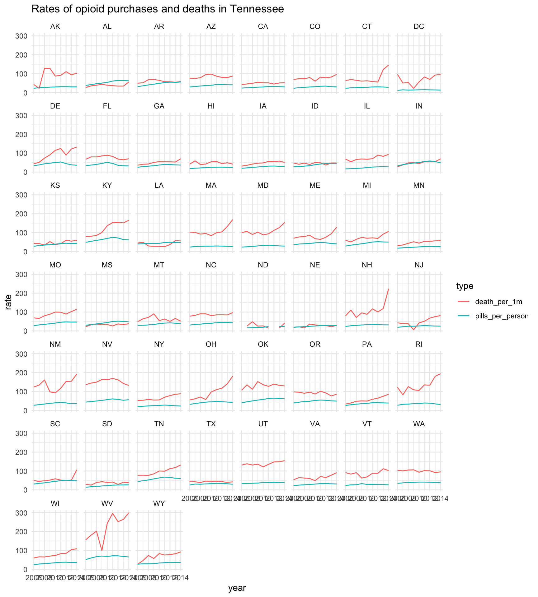
Okay, that’s a start. We see some interesting variability…
There’s a cluster around the states that start with M and O and W! But that’s not relevant!
The problem is the states are all alphabetical. That’s not a huge problem for categorical data most of the time but we’re used to states in certain areas in relation to other states, right?
This is a great opportunity for the package geofacetwhich adds on to ggplot2 that makes it easy to create geographically faceted visualizations. No state is a silo. By mimicking the original geographic topology, you can see patterns much more clearly.
It’s very simple.
Instead of using facet_wrap() from ggplot2, you load the geofacet package and use the function facet_geo().
# same lines as before
state_df %>%
  ggplot(aes(x=year, y=rate, color=type)) +
  geom_line() +
# deleting the line below
# facet_wrap(vars(buyer_state), ncol=8) +
  facet_geo(vars(buyer_state)) +
  theme_minimal() +
  labs(title="Rates of opioid purchases and deaths by state")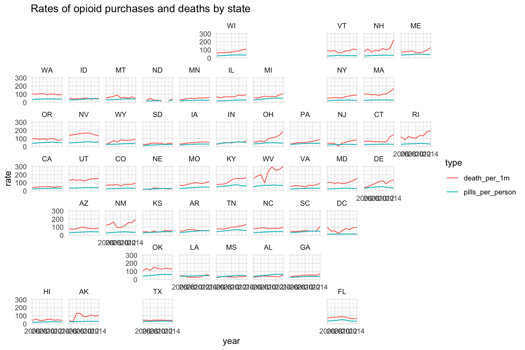
Isn’t this better? What sort of regional patterns can you spot now?
The states surrounding West Virginia were definitely affected by opioid overdoses.
In the last few years of data, it appears like the Northeast was deeply affected.
If you don’t like that shape, you can pass it an argument for what type of grid to use. Instead of the default, we’ll pass it the argument “us_state_grid2” which I personally like more.
And we’ll clean up the labels in the x axis.
state_df %>%
  ggplot(aes(x=year, y=rate, color=type)) +
  geom_line() +
# deleting the line below
# facet_geo(vars(buyer_state)) +
  facet_geo(vars(buyer_state), grid = "us_state_grid2") +
  theme_minimal() +
# adding in a new line
  scale_x_continuous(breaks=c(2006, 2014),
                     labels=c("'06", "'14")) +
  labs(title="Rates of opioid purchases and deaths in the U.S.")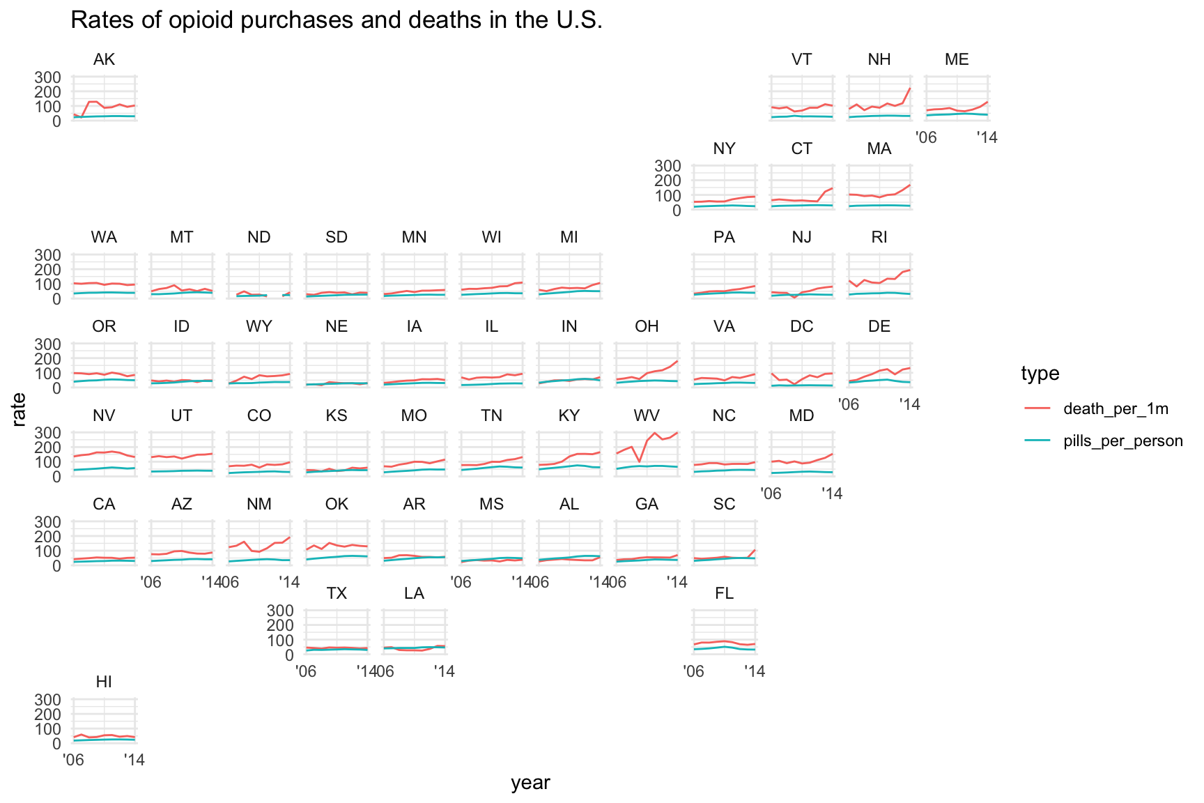
The geofacets aren’t limited to states.
There are 140+ grids available so far, from European countries, to regions in New Zealand, to provinces of Afghanistan. Check out the complete list for now– if you don’t see one that you’re looking for, it’s very simple to create your own and submit a pull request.
For now, let’s pull in some county level data.
county_df <- read_csv("data/opioids_counties.csv")

glimpse(county_df)
Rows: 55,516
Columns: 13
$ buyer_county <chr> "ABBEVILLE", "ABBEVILLE", "ABBEVILLE", "ABBEVILLE", "ABBE…
$ buyer_state <chr> "SC", "SC", "SC", "SC", "SC", "SC", "SC", "SC", "SC", "SC…
$ year <dbl> 2006, 2006, 2007, 2007, 2008, 2008, 2009, 2009, 2010, 201…
$ count <dbl> 877, 877, 908, 908, 871, 871, 930, 930, 1197, 1197, 1327,…
$ dosage_unit <dbl> 363620, 363620, 402940, 402940, 424590, 424590, 467230, 4…
$ countyfips <chr> "45001", "45001", "45001", "45001", "45001", "45001", "45…
$ state <chr> NA, NA, NA, NA, NA, NA, NA, NA, NA, NA, NA, NA, NA, NA, N…
$ county <chr> NA, NA, NA, NA, NA, NA, NA, NA, NA, NA, NA, NA, NA, NA, N…
$ deaths <dbl> NA, NA, NA, NA, NA, NA, NA, NA, NA, NA, NA, NA, NA, NA, N…
$ crude_rate <chr> NA, NA, NA, NA, NA, NA, NA, NA, NA, NA, NA, NA, NA, NA, N…
$ population <dbl> 25821, 25821, 25745, 25745, 25699, 25699, 25347, 25347, 2…
$ type <chr> "death_per_100k", "pills_per_person", "death_per_100k", "…
$ rate <dbl> NA, 14.1, NA, 15.7, NA, 16.5, NA, 18.4, NA, 21.0, NA, 22.…Let’s narrow down the county data to only Tennessee.
tennessee <- county_df %>%
  filter(buyer_state=="TN")

glimpse(tennessee)
Rows: 1,702
Columns: 13
$ buyer_county <chr> "ANDERSON", "ANDERSON", "ANDERSON", "ANDERSON", "ANDERSON…
$ buyer_state <chr> "TN", "TN", "TN", "TN", "TN", "TN", "TN", "TN", "TN", "TN…
$ year <dbl> 2006, 2006, 2007, 2007, 2008, 2008, 2009, 2009, 2010, 201…
$ count <dbl> 11948, 11948, 12708, 12708, 14350, 14350, 15784, 15784, 1…
$ dosage_unit <dbl> 5065930, 5065930, 5354720, 5354720, 5800560, 5800560, 627…
$ countyfips <chr> "47001", "47001", "47001", "47001", "47001", "47001", "47…
$ state <chr> "Tennessee", "Tennessee", NA, NA, "Tennessee", "Tennessee…
$ county <chr> "Anderson County, TN", "Anderson County, TN", NA, NA, "An…
$ deaths <dbl> 10, 10, NA, NA, 11, 11, NA, NA, 11, 11, 14, 14, 11, 11, 2…
$ crude_rate <chr> "Unreliable", "Unreliable", NA, NA, "Unreliable", "Unreli…
$ population <dbl> 73117, 73117, 73580, 73580, 74397, 74397, 73382, 73382, 7…
$ type <chr> "death_per_100k", "pills_per_person", "death_per_100k", "…
$ rate <dbl> 13.7, 69.3, NA, 72.8, 14.8, 78.0, NA, 85.5, 14.8, 84.8, 1…Let’s make a small multiple chart using the county-level data for Tennessee.
We’ll have to pass it the grid argument of “us_tn_counties_grid1”.
Also, you may want to copy and paste the chunk of code to run in console so the map shows up in the viewer instead of the notebook. Then you can expand it out and see the names better.
tennessee %>%
  mutate(buyer_county=str_to_title(buyer_county)) %>%
  ggplot(aes(x=year, y=rate, color=type)) +
  geom_line() +
  facet_geo(vars(buyer_county), grid = "us_tn_counties_grid1") +
  theme_minimal() +
  scale_x_continuous(breaks=c(2006, 2014),
                     labels=c("'06", "'14")) +
  labs(title="Rates of opioid purchases and deaths in Tennessee")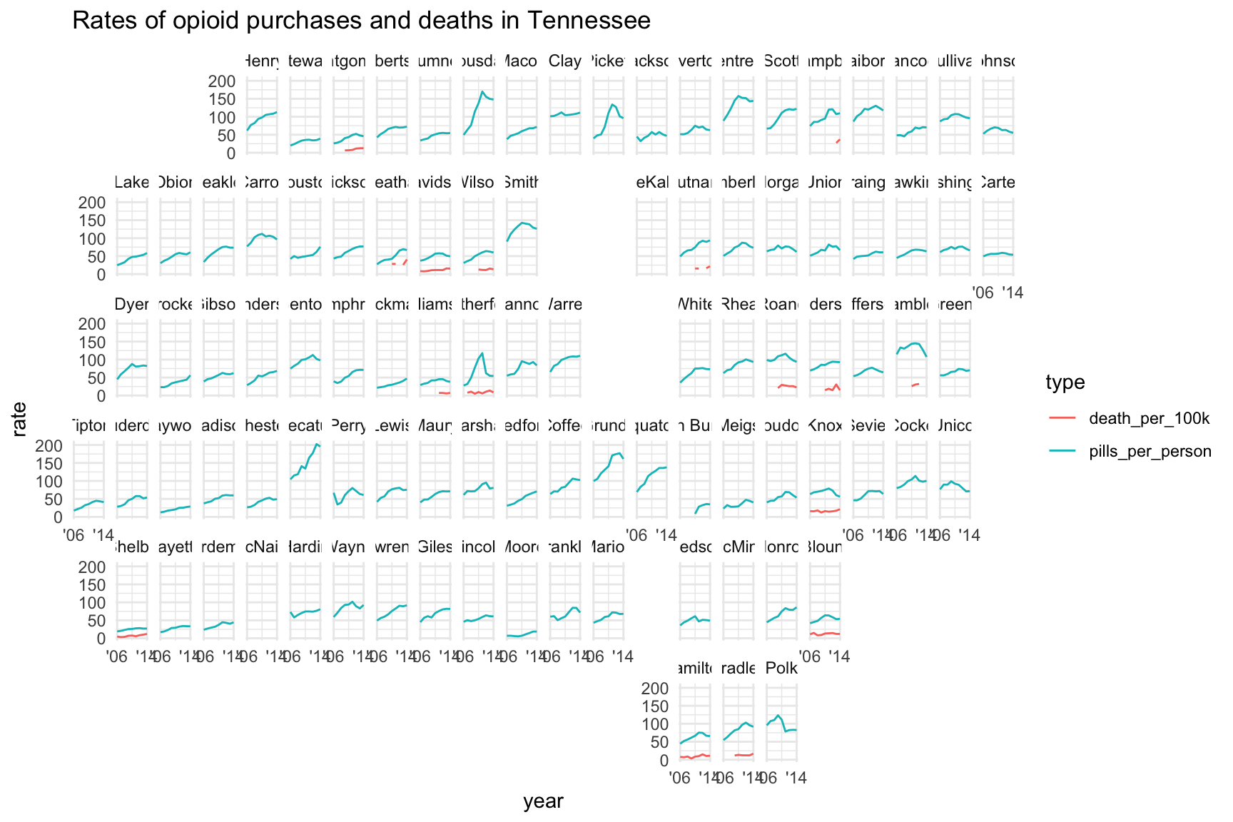
Fascinating! It’s a little crammed together to fit on this specific page.
If you ran it in your console you may have a pop up where the names all fit.
There’s a lot of data missing because there weren’t enough annual deaths for CDC to release the data. You may need to widen the scope of the CDC query or go to the state health department for the missing data.
Let’s try another way to visualize the relationship between deaths and purchases.
When you’re done with this section, move on to ggrepel.
Quick aside
I wanted to highlight a geofacet project that made it to publication: The staggering scope of U.S. gun deaths goes far beyond mass shootings [link]
- Simple geofacet dataviz of how restrictive gun laws are by state.

- Overlaying rates of firearm deaths with estimated fire arm purchases with the restrictive gun law categorized overlaid.

- Highlighting for context areas of interest and why

- One more viz with small multiples of geofacets and grouped slope graphs based on strength of gun control laws.

Props to Artur Galocha for putting this beautiful viz together based off from some very basic exploratory data viz.