#install.packages("usethis")
usethis::use_course("https://github.com/r-journalism/nicar-2023-fancier-viz/archive/master.zip")

# Run this in the console of RStudio
file.edit("ggtext.qmd")ggtext
You can follow along with the ggtext.qmd file in the nicar-2023-fancier-viz project folder that you downloaded in the First steps link.
If you’ve downloaded the appropriate data files and put them in a data folder, you can just copy and paste all the code in the gray boxes in an R script.
We’re going to try a package called ggtext. This will allow us to change the formats of text in our ggplot2 graphics with html code!
Type out or copy and paste all the code in all the gray sections below in your own script or console or run the chunks as they appear in the ggtext.qmd file.
Let’s load the libraries, import the state-level data and see the structure of the data we’ve imported.
library(tidyverse)
library(ggtext)

state_df <- read_csv("data/opioids_states.csv")
Seems familiar!
Let’s look only at Tennessee.
We’ll use the ggplot2 function scale_color_manual() to change the colors of the geom_line()
p <- state_df %>%
  filter(state=="Tennessee") %>%
  ggplot(aes(x=year, y=rate, color=type)) +
    scale_color_manual(
    values = c(death_per_1m = "#0072B2", pills_per_person = "#D55E00")
  ) +
  geom_line() +
  theme_minimal() +
  theme(legend.position = 'bottom') +
  labs(title="Rates of opioid purchases and deaths in Tennessee",
       x = "Year",
       y = "Rate")

p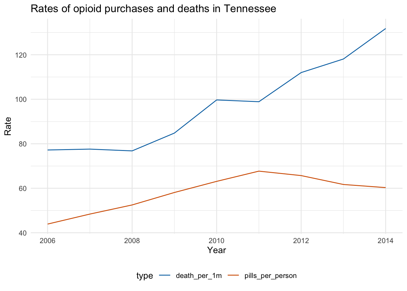
This is fine, but let’s try to make it publication-ready.
First, let’s get rid of the legends at the bottom and incorporate the colors into a subtitle.
And we’re going to use a function from ggtext called element_markdown() within the theme() function from ggplot2.
It’s an alternative to element_text() which is the usual way to modify how the text is rendered in a plot– like font and height and color. but element_markdown() adds oomph to it. This will allow us to pass html code into the text and have it rendered!
p <- state_df %>%
  filter(state=="Tennessee") %>%
  ggplot(aes(x=year, y=rate, color=type)) +
    scale_color_manual(
    values = c(death_per_1m = "#0072B2", pills_per_person = "#D55E00"),
    guide="none"
  ) +
  geom_line() +
  # don't need this anymore
  # theme(legend.position = 'bottom') +
  theme_minimal() +
# This is new: element_markdown()
  theme(
    text= element_text(family = "Times"),
    plot.title.position = "plot",
    plot.title= element_markdown(size=11, lineheight = 1.2)
  ) +
# Everything can go into title along with html code
  labs(title = "<strong>Rates of opioid purchases and deaths in Tennessee</strong><br>
<span style = 'font-size:10pt;'>The annual increase in the sale of <span style = 'color:#0072B2;'>opioid pills per person</span> corresponded with the increase <br />in <span style = 'color:#D55E00;'>overdose deaths per million residents</span> until 2011 when sales declined while deaths kept increasing.",
       x = "Year",
       y = "Rate")
p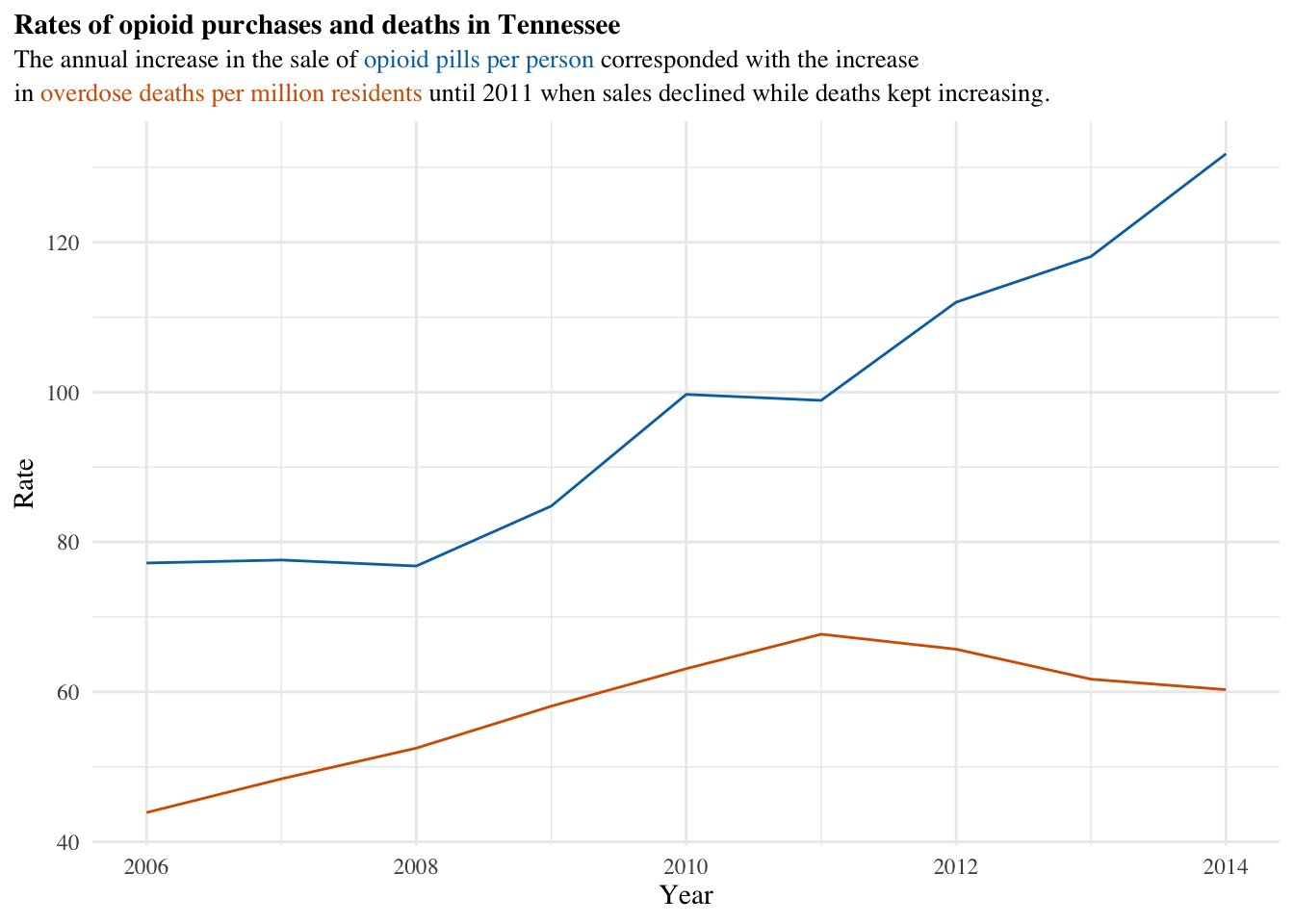
p <- state_df %>%
  filter(state=="Tennessee") %>%
  ggplot(aes(x=year, y=rate, color=type)) +
    scale_color_manual(
    values = c(death_per_1m = "#0072B2", pills_per_person = "#D55E00"),
    guide="none"
  ) +
  geom_line() +
  # don't need this anymore
  # theme(legend.position = 'bottom') +
  theme_minimal() +
# This is new: element_markdown()
  theme(
    text= element_text(family = "Times"),
    plot.title.position = "plot",
    plot.title= element_markdown(size=11, lineheight = 1.2)
  ) +
# Everything can go into title along with html code
  labs(title = "<strong>Rates of opioid purchases and deaths in Tennessee</strong><br>
<span style = 'font-size:10pt;'>The annual increase in the sale of <span style = 'color:#0072B2;'>opioid pills per person</span> corresponded with the increase <br />in <span style = 'color:#D55E00;'>overdose deaths per million residents</span> until 2011 when sales declined while deaths kept increasing.",
       x = "Year",
       y = "Rate",
       caption= "Data: CDC and The Washington Post DEA ARCOS api"
  ) +
  geom_richtext(aes(x=2012, y=80,
                    #lineheight=.5,
                    angle = -10,
                    label="<span style = 'font-size:8pt'>
                    In 2012, Tennessee lawmakers<br/>
                    began passing legislation to address <br />
                    prescription drug abuse.</span>"))
p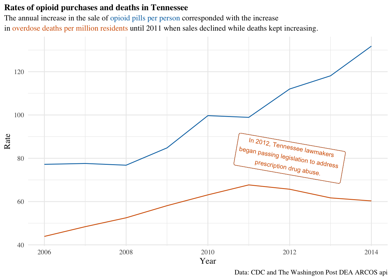
Excellent!
Be sure to check out the documentation for a few other commands!
Okay, I couldn’t get to ridgeplots.
But if you really want, there’s some documentation here for ggridges
And for fun, you can convert any image you want into a ridge plot:
The code