mapbox choropleth

Alright, let’s make some chropleths with mapdeck (mapbox+webgl).

We made a quick one in the previous dot density walkthrough, but let’s do it again with a few more styling options this time. We’ll work with the arcos opioid data so it’s similar to the leaflet-choropleths walkthrough.

The repo containing the data and scripts for this section is on Github. To follow along, simply run the lines of code below in R.


# There is no need to run these install lines below if you already have done so
install.packages("usethis")
usethis::use_course("https://github.com/andrewbtran/NICAR-2020-mapping/archive/master.zip")

# This section is in scripts/06_mapbox_choropleths.R
file.edit("scripts/06_mapbox_choropleths.R")
# This function checks if you don't have the correct packages installed yet
# If not, it will install it for you
packages <- c("sf", "tidyverse", "tigris",
              "arcos", "mapdeck")
if (length(setdiff(packages, rownames(installed.packages()))) > 0) {
  install.packages(setdiff(packages, rownames(installed.packages())), repos = "https://cran.us.r-project.org")  
}
library(sf)
library(tidyverse)
library(tigris)
library(arcos)
counties <- st_read("shapefiles/us_counties.shp")

Let’s load the mapdeck library and put in the Mapbox API key.

library(mapdeck)

Attaching package: 'mapdeck'
The following object is masked from 'package:tibble':

    add_column
mb_key <- "PutYourKeyHere"
mapdeck(token = mb_key, 
        style = mapdeck_style("light"),
        zoom=10) %>%
  add_polygon(
    data =counties,
    fill_opacity=0.1,
    stroke_colour="black",
    stroke_width=1
  )

Alright, let’s bring in some data to join with the county shapes.

#### Import data we want to map ----------------
annual_summary <- read_csv("data/county_pill_summary.csv")

Join the data.

In the leaflet walkthrough we used the geo_join() function from the tigris package, but the counties and annual_summary objects are both dataframes, so a simple left_join() from dplyr will do just fine.

counties_merged_annual <- left_join(counties, annual_summary, by=c("GEOID"="countyfips"))

counties_merged_annual <- counties_merged_annual %>% 
  filter(!is.na(avg_pills_per_person))

# Setting up the popup text
popup_sb <- paste0(counties_merged_annual$BUYER_COUNTY, ", ", counties_merged_annual$BUYER_STATE, "</br/> Average pills per person: \n", as.character(counties_merged_annual$avg_pills_per_person))

Check out the options that we can use with add_polygon().

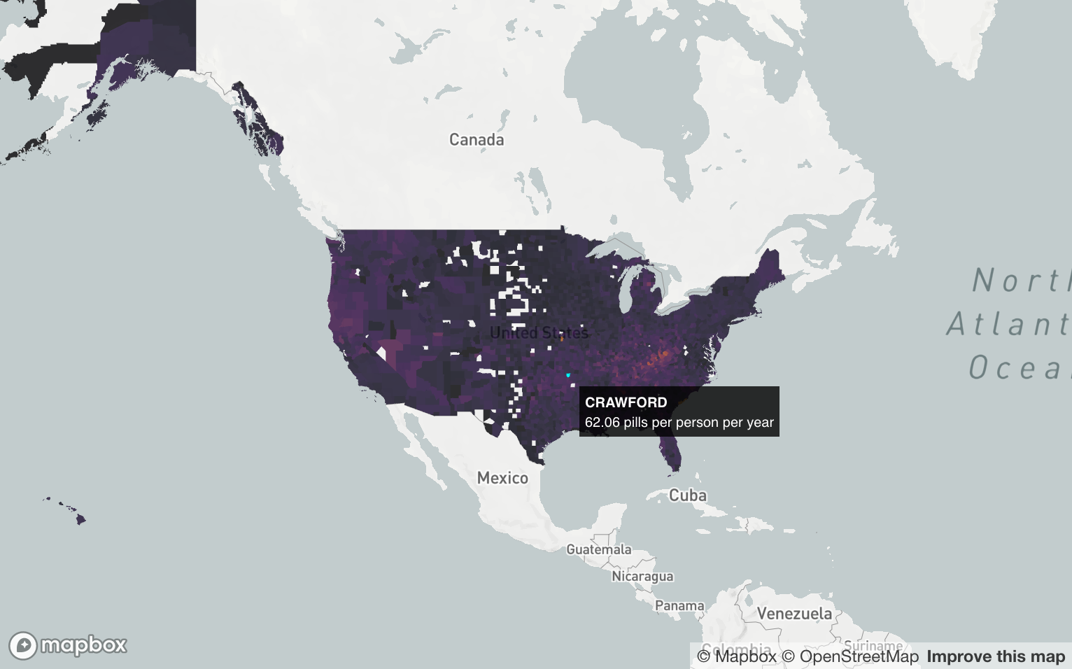
counties_merged_annual$popup <- paste0("<strong>",counties_merged_annual$BUYER_COUNTY, "</strong><br />", counties_merged_annual$avg_pills_per_person, " pills per person per year")
mapdeck(token = mb_key, 
        style = mapdeck_style("light"),
        zoom=2,
        location=c(-98.294108,39.628777))%>% 
    add_polygon(
    data = counties_merged_annual,
    fill_colour = "avg_pills_per_person",
    fill_opacity = .9,
    auto_highlight = TRUE,
    palette = "inferno",
    tooltip = "popup",
    update_view = FALSE
  )

Let’s get crazy

Add some elevation data.

# We'll need to boost the numbers a bit so the elevation can be seen zoomed out
counties_merged_annual$elevation <- counties_merged_annual$avg_pills_per_person^2.4

mapdeck(token = mb_key, 
        style = mapdeck_style("light"),
        zoom=2,
        location=c(-98.294108,39.628777),
        pitch = 45 
        )%>% 
    add_polygon(
      data = counties_merged_annual,
      fill_colour = "avg_pills_per_person",
      fill_opacity = .9,
      auto_highlight = TRUE,
      palette = "inferno",
      tooltip = "popup",
      update_view = FALSE,
      elevation = "elevation"
    )

Fancy heat map

Let’s bring in pharmacy locations in Louisiana.

la_pharmacies <- read_csv("data/la_pharmacies.csv")
Rows: 1548 Columns: 14
── Column specification ────────────────────────────────────────────────────────
Delimiter: ","
chr (9): BUYER_DEA_NO, BUYER_BUS_ACT, BUYER_COUNTY, BUYER_STATE, BUYER_NAME,...
dbl (5): avg, linear_average, lat, lon, BUYER_ZIP

ℹ Use `spec()` to retrieve the full column specification for this data.
ℹ Specify the column types or set `show_col_types = FALSE` to quiet this message.
glimpse(la_pharmacies)
Rows: 1,548
Columns: 14
$ BUYER_DEA_NO       <chr> "AA1120473", "AA2494033", "AA2511295", "AA2817041",…
$ BUYER_BUS_ACT      <chr> "CHAIN PHARMACY", "CHAIN PHARMACY", "RETAIL PHARMAC…
$ BUYER_COUNTY       <chr> "EAST BATON ROUGE", "EAST BATON ROUGE", "IBERIA", "…
$ BUYER_STATE        <chr> "LA", "LA", "LA", "LA", "LA", "LA", "LA", "LA", "LA…
$ avg                <dbl> 0.4, 0.3, 6.9, 7.6, 0.3, 0.3, 14.7, 1.4, 0.0, 0.1, …
$ linear_average     <dbl> 0.022584127, 0.015793489, 0.429873922, 0.473277328,…
$ lat                <dbl> 30.3969, 30.5145, 30.0019, 29.7019, 30.4322, 29.966…
$ lon                <dbl> -91.1099, -91.0279, -91.8416, -90.5645, -91.0833, -…
$ BUYER_NAME         <chr> "ALBERTSONS LLC", "SAV-A-CENTER PHARMACY #10", "ACK…
$ BUYER_ADDRESS1     <chr> "7515 PERKINS ROAD", "14485 GREENWELL SPRINGS ROAD"…
$ BUYER_CITY         <chr> "BATON ROUGE", "GREENWELL SPRINGS", "NEW IBERIA", "…
$ BUYER_ZIP          <dbl> 70808, 70739, 70560, 70394, 70815, 70121, 70546, 71…
$ BUYER_ADDL_CO_INFO <chr> "SAV-ON PHARMACY #1311", NA, NA, NA, "SAV-ON PHARMA…
$ BUYER_ADDRESS2     <chr> NA, NA, NA, NA, NA, "1514 JEFFERSON HWY", "403 W PL…

The key thing here is that this dataset represents the locations of around 1,600 pharmacies.

Let’s see what that looks like really quick.

mapdeck(token = mb_key, style = mapdeck_style("light"),
        zoom=6,
        location=c(-92.485530,31.335469)) %>% 
  add_scatterplot(
    data=la_pharmacies,
    radius=10,
    fill_opacity=.3,
    update_view= FALSE
  )

We could map out each dot like we have before, but let’s say we wanted to do something like a heatmap. But different.

Let’s do a hexagon grid-based heatmap.

And we’ll add a legend as an option.

mapdeck(token = mb_key, style = mapdeck_style("light"),
        zoom=7,
        location=c(-92.485530,31.335469)) %>% 
  add_hexagon(
    data=la_pharmacies,
    radius=4000,
    update_view= FALSE,
    legend = TRUE,
    legend_options=list(title="Pharmacies"),
    #elevation_scale = 100,
    colour_range = colourvalues::colour_values(6:1, palette = colourvalues::get_palette("viridis")[70:256,])
  )

Now instead of clusters, we get color-shaded hex grids that indicate a high amount of pharmacies in a specific area.

There’s one more version of this in mapbox/mapdeck, square grids.

mapdeck(token = mb_key, style = mapdeck_style("light"),
        zoom=7,
        location=c(-92.485530,31.335469)) %>% 
  add_screengrid(
    data=la_pharmacies,
    
    update_view= FALSE,
    cell_size = 10,
    opacity=.5,
    colour_range = colourvalues::colour_values(6:1, palette = colourvalues::get_palette("viridis")[70:256,])
  )

It’s also quite easy to add a layer of text labels on top of your other layers.

location <- data.frame(
  txt="NICAR 2020",
  lon=-90.067511,
  lat=29.952622
)

mapdeck(token = mb_key, style = mapdeck_style("light"),
        zoom=12,
        location=c(-90.067511, 29.952622)) %>% 
  add_screengrid(
    data=la_pharmacies,
    cell_size = 10,
    opacity=.5,
    colour_range = colourvalues::colour_values(6:1, 
    palette = colourvalues::get_palette("viridis")[70:256,])
    ) %>% 
  add_text(
    data=location,
    lon = 'lon',
    lat = 'lat',
    fill_colour = 'red',
    text = 'txt',
    size = 16,
    update_view= FALSE

  )