leaflet choropleth

Choropleth or thematic maps are an effective and popular way to show geographic data.


The repo containing the data and scripts for this section is on Github. To follow along, simply run the lines of code below in R.

# There is no need to run these install lines below if you already have done so
install.packages("usethis")
usethis::use_course("https://github.com/andrewbtran/NICAR-2020-mapping/archive/master.zip")

# This section is in scripts/03_leaflet_choropleth.R
file.edit("scripts/03_leaflet_choropleth.R")

There’s a lot you must consider when making a choropleth map:

Adding interactivity to your graphic allows your most interested users to dig deep, explore the full data set, and establishes trust.

Making choropleths

To make a choropleth map, you first need a spatial data representing geographic boundaries. The term you hear most frequently are “shapefiles” but they could also be GeoJSONs, or TopoJSON, or KML, or even KMZ files, among others.

Basics

There are two underlying important pieces of information for spatial data:

  • Coordinates of the object
  • How the coordinates relate to a physical location on Earth
    • Also known as coordinate reference system or CRS

CRS

  • Geographic
    • Uses three-dimensional model of the earth to define specific locations on the surface of the grid
    • longitude (East/West) and latitude (North/South)
  • Projected
    • A translation of the three-dimensional grid onto a two-dimensional plane

Raster versus Vector data

Spatial data with a defined CRS can either be vector or raster data.

  • Vector (Think Mapbox)
    • Based on points that can be connected to form lines and polygons
    • Located with in a coordinate reference system
    • Example: Road map
  • Raster (Think Google Maps and Leaflet)
    • Are values within a grid system
    • Example: Satellite imagery

sf vs sp

  • An older package, sp, lets a user handle both vector and raster data.
  • This class will focus on vector data and the sf package.

`It also takes much more effort to get your system ready for it (*shakes fist at gdal*). The main differences between the **sp** and **sf** packages are how they store CRS information. While **sp** uses spatial sub classes, **sf** stores data in data frames, allowing it to interact with **dplyr** methods we've learned so far. I encourage you to check out other spatial data analysis and modeling [classes](https://www.rspatial.org/) if you remain interested in this afterward.</aside>

Shape files

Though we refer to a shape file in the singular, it’s actually a collection of at least three basic files:

  • .shp - lists shape and vertices
  • .shx - has index with offsets
  • .dbf - relationship file between geometry and attributes (data)

All files must be present in the directory and named the same (except for the file extension) to import correctly.

R can handle importing different kinds of file formats for spatial data, including KML and geojson and even topojson. We'll focus on shape files, which was created by ESRI in the '90s.

The plan

  1. Map blank shape file we have already downloaded and is on the local machine
  2. Download opioid pain pill data for Louisiana via the arcos api
  3. Map data to blank shape file and map results

We can use magrittr %>% pipes because the leaflet package developers incorporated its function structure. We need three functions starting out:

  • leaflet() - initializes the leaflet function
  • addTiles() - the underlying map tiles
  • addPolygons() - instead of dots, we’re adding Polygons, or shapes
    • Passing the argument popup to the function with the variable NAME from the shape file
# This function checks if you don't have the correct packages installed yet
# If not, it will install it for you
packages <- c("tidyverse", "readr", "httpuv",
              "leaflet", "sf", "tigris", "arcos",
              "sp", "rmapshaper")
if (length(setdiff(packages, rownames(installed.packages()))) > 0) {
  install.packages(setdiff(packages, rownames(installed.packages())), repos = "https://cran.us.r-project.org")  
}

library(sf)
library(leaflet)
library(tidyverse)
library(arcos)
library(tigris)

Importing shapefiles from the Census

There are more packages that people are producing in R that will pull polygons straight into R. For example, there’s an R package called Tigris that pulls from the Census TIGER shapefiles ftp server.

I’ve already downloaded the files to a folder called shapefiles. If you’ve downloaded the walkthrough files to your computer, they’re stored locally.

Importing shapefiles from your computer

# importing in the shapefile
counties <- st_read("shapefiles/us_counties.shp")

Visualizing the shapefile

counties %>% 
  leaflet() %>% 
  addTiles() %>% 
  addPolygons(popup=~NAME)

This is how it looks raw. The Census shape files also include territories, like Guam and Puerto Rico.

When mapping, we’ll have to remember to exclude them if they show up.

Joining data to a shapefile

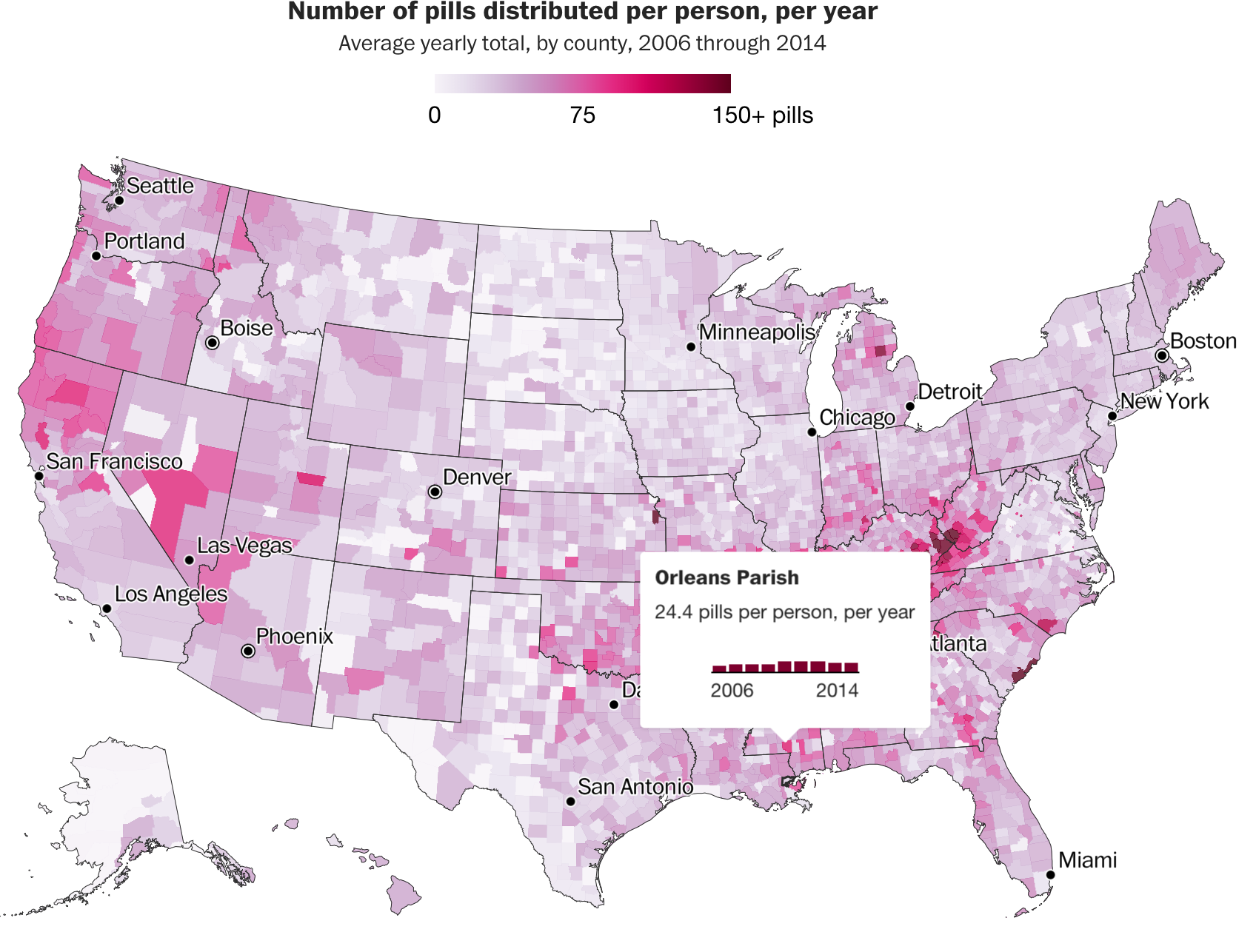
Let’s make a choropleth map based on number of opioids sold per state.

This data is pulled and transformed from the arcos api.

annual_summary <- read_csv("data/county_pill_summary.csv")

# If you'd like to build the data above from scratch
# using the arcos api, uncomment and run the lines below

#annual_counties <- summarized_county_annual(key="WaPo")
#annual_population <- county_population(key = "WaPo")
#annual <- left_join(annual_counties, annual_population)
#annual <- annual %>% 
#  mutate(pills_per_person=round(DOSAGE_UNIT/population,2))


#annual_summary <- annual %>% 
#  group_by(BUYER_COUNTY, BUYER_STATE, countyfips) %>% 
#  summarize(avg_pills_per_person=round(mean(pills_per_person, na.rm=T),2))

glimpse(annual_summary)
Rows: 3,130
Columns: 4
$ BUYER_COUNTY         <chr> "ABBEVILLE", "ACADIA", "ACCOMACK", "ADA", "ADAIR"…
$ BUYER_STATE          <chr> "SC", "LA", "VA", "ID", "IA", "KY", "MO", "OK", "…
$ countyfips           <chr> "45001", "22001", "51001", "16001", "19001", "210…
$ avg_pills_per_person <dbl> 18.73, 40.08, 20.87, 37.56, 25.62, 50.65, 49.02, …

That’s some interesting looking data.

Tigris includes a useful function called geo_join() to bring together shape files and data frames. You may have used dplyr joins before, but geo_join() lets you join to non dataframe shape files.

We’ll also use a leaflet function called colorNumeric() that will turn the continuous variable of numbers of stores into a categorical variable by dividing it into bins and assigning it a hue of color we want. In this instance: Greens. Because, obviously.

Also setting up a separate array of pop up text for the map.

# Now we use the Tigris function geo_join to bring together 
# the states shapefile and the sb_states dataframe -- GEOID and countyfips
# are the two columns they'll be joined by

counties_merged_annual <- geo_join(counties, annual_summary, "GEOID", "countyfips")


# Getting rid of rows with NA values
# Using the Base R method of filtering subset() because we're dealing with a SpatialPolygonsDataFrame and not a normal data frame, thus filter() wouldn't work

counties_merged_annual <- subset(counties_merged_annual, !is.na(avg_pills_per_person))

pal <- colorNumeric("Greens", domain=counties_merged_annual$avg_pills_per_person)

# Setting up the popup text
popup_sb <- paste0(counties_merged_annual$BUYER_COUNTY, ", ", counties_merged_annual$BUYER_STATE, "</br/> Average pills per person: \n", as.character(counties_merged_annual$avg_pills_per_person))

Next, the map.

We’re adding a few more leaflet functions.

  • addProviderTiles() - instead of addTiles()
  • setView() - sets the starting position of the map
    • Centers it on defined coordinates with a specific zoom level
  • Lots of arguments passed to addPolygons()
    • fillColor()
    • fillOpacity()
    • weight
    • smoothFactor()
  • addLegend() - same as in the previous section but with more customization
# Mapping it with the new tiles CartoDB.Positron
leaflet() %>%
  addProviderTiles("CartoDB.Positron") %>%
  setView(-98.483330, 38.712046, zoom = 4) %>% 
  addPolygons(data = counties_merged_annual , 
              fillColor = ~pal(counties_merged_annual$avg_pills_per_person), 
              fillOpacity = 1, 
              weight = 0.9, 
              smoothFactor = 0.2, 
              stroke=TRUE,
              color="white",
              popup = ~popup_sb) %>%
  addLegend(pal = pal, 
            values = counties_merged_annual$avg_pills_per_person, 
            position = "bottomright", 
            title = "Average pills per person")

That’s beautiful.

But we can do better!

Like, where’s Alaska and Hawaii? We have to do some map dragging to get them in the viewer window.

While we’re at it, let’s pick a new projection for the map so it’s not so flat. Also, we should add some state borders.

We’re aiming to get this map as close as possible to the Post’s published version.

We’ll use a few new packages for dealing with spatial data.

  • rmapshaper (an R port of mapshaper tools that carto nerds love)
  • albersusa (custom tools and shapefiles for “AlbersUSA” projections [link])

For the sake of time, we’ll load the shapefiles locally.

But the code to get the polygon data all within R is in the commented code below.

#library(sp)

# albersusa is not on CRAN so you need to uncomment 
# the code below and run it to install
#remotes::install_github("hrbrmstr/albersusa")

#library(albersusa)

#counties_reprojected <- counties_sf()
#states_reprojected <- usa_sf()

counties_reprojected <- st_read("shapefiles/counties_reprojected.shp")
Reading layer `counties_reprojected' from data source 
  `/Users/andrewtran/Projects/nicar_hands_on_website/2020/shapefiles/counties_reprojected.shp' 
  using driver `ESRI Shapefile'
Simple feature collection with 3143 features and 8 fields
Geometry type: MULTIPOLYGON
Dimension:     XY
Bounding box:  xmin: -124.7332 ymin: 20.63151 xmax: -66.9499 ymax: 49.38436
Geodetic CRS:  WGS 84
states_reprojected <- st_read("shapefiles/states_reprojected.shp")
Reading layer `states_reprojected' from data source 
  `/Users/andrewtran/Projects/nicar_hands_on_website/2020/shapefiles/states_reprojected.shp' 
  using driver `ESRI Shapefile'
Simple feature collection with 51 features and 13 fields
Geometry type: MULTIPOLYGON
Dimension:     XY
Bounding box:  xmin: -124.7332 ymin: 20.63151 xmax: -66.9499 ymax: 49.38436
Geodetic CRS:  WGS 84
library(rmapshaper)
The legacy packages maptools, rgdal, and rgeos, underpinning the sp package,
which was just loaded, will retire in October 2023.
Please refer to R-spatial evolution reports for details, especially
https://r-spatial.org/r/2023/05/15/evolution4.html.
It may be desirable to make the sf package available;
package maintainers should consider adding sf to Suggests:.
The sp package is now running under evolution status 2
     (status 2 uses the sf package in place of rgdal)
# simplifying the state borders so they're smaller
state_borders <- rmapshaper::ms_simplify(states_reprojected, keep = 0.1)

Okay, let’s merge our summarized data with the shapefiles and clean it up a bit.

counties_merged_annual_re <- left_join(counties_reprojected, annual_summary, by=c("fips"= "countyfips"))

# Getting rid of rows with NA values
# These are dataframes so we can use filter instead of subset

counties_merged_annual_re <- filter(counties_merged_annual_re, !is.na(avg_pills_per_person)) %>% 
  arrange(desc(fips))

Now, let’s prepare some styles and projections for the map.

# setting up a color palette depending 
# on the range of numbers in avg_pills_per_person
# pal <- colorNumeric("Reds", domain = counties_merged_annual$avg_pills_per_person)

# but i'm cheating by setting the ceiling at 150
# and anything above that will be a darker color 
# that I set up in the NA field
pal <- colorNumeric("Reds", domain =0:150, na.color = "#640E27")

library(sp)
# this sets up some custom projection in leaflet
# complicated but necessary
epsg2163 <- leafletCRS(
  crsClass = "L.Proj.CRS",
  code = "EPSG:2163",
  proj4def = "+proj=laea +lat_0=45 +lon_0=-100 +x_0=0 +y_0=0 +a=6370997 +b=6370997 +units=m +no_defs",
  resolutions = 2^(16:7))

Visualizing the reprojected map

m <- leaflet(counties_merged_annual_re, options = leafletOptions(crs = epsg2163)) %>%
  addPolygons(data=counties_reprojected, fillOpacity = 1, 
              weight = 0.9, 
              smoothFactor = 0.2, 
              stroke=TRUE,
              color="white") %>% 
  addPolygons(
    fillColor = ~pal(avg_pills_per_person), fillOpacity = 1, 
              weight = 0.9, 
              smoothFactor = 0.2, 
              stroke=TRUE,
              color="white",
    label = ~paste(BUYER_COUNTY, avg_pills_per_person),
    labelOptions = labelOptions(direction = "auto"))

m

Beautiful!

We’re closer to the final production.

But we could add some bar charts.

One hack is to generate charts for each county using annual data and then use html to display them when clicking on a county.

I’ve already generated those charts in the “minicharts” folder for you.

If you want to see how to programatically generate those charts yourself, I’ve left that code in the comments below.

#library(arcos)
#annual_counties <- summarized_county_annual(key="WaPo")
#annual_population <- county_population(key = "WaPo")
#annual <- left_join(annual_counties, annual_population)
#annual <- annual %>% 
#  mutate(pills_per_person=round(DOSAGE_UNIT/population,2))

#annual <- filter(annual, !is.na(countyfips))
#county_list <- unique(annual$countyfips)


#for (i in 1:length(county_list)) {

#    county_to_slice_out <- county_list[i]
    
#    dataFiltered<-filter(annual,countyfips==county_to_slice_out)

#    p<- ggplot(dataFiltered,aes(year, pills_per_person)) +
#      geom_col(fill="#640E27") +
#      theme_minimal() +
#      scale_x_discrete(limits=c(2006, 2012)) +
#      theme(axis.title.y=element_blank(),
#            axis.text.y=element_blank(),
#        axis.ticks.y=element_blank(),
#        panel.grid.major = element_blank(),
#        panel.grid.minor = element_blank()) +
#      labs(y="", x="")
    
#    if (!dir.exists("minicharts")) {
#      dir.create("minicharts")
#    }
    
#    file_dir <- "minicharts"
#    file_name <- paste0(county_list[i], ".png")
#    file_save <- paste0(file_dir, "/", file_name)
    
 #   ggsave(filename=file_name, path=file_dir, plot=p, width=70, height=30, units="mm") 
#    print(paste0(file_save, "-", i, " of ", length(county_list)))
#}

Okay, we need to customize our pop up code carefully.

# you'll want to replace the img src url
# with the path to where you host your images

popup_sb <- paste0(
  "<strong>",
  str_to_title(counties_merged_annual_re$BUYER_COUNTY),
  " County</strong></br>",
  round(counties_merged_annual_re$avg_pills_per_person, 1),
  " pills per person, per year </br>
  <img src='",
  getwd(),
  "/minicharts/", counties_merged_annual_re$fips, ".png' width=150px, height=60px</>")

Alright, how does this look?

leaflet(counties_merged_annual_re, options = leafletOptions(crs = epsg2163)) %>%
  addPolygons(data=counties_reprojected, fillOpacity = 1, 
              weight = 0.9, 
              smoothFactor = 0.2, 
              stroke=TRUE,
              color="white") %>% 
  addPolygons(
    fillColor = ~pal(avg_pills_per_person), fillOpacity = 1, 
              weight = 0.9, 
              smoothFactor = 0.2, 
              stroke=TRUE,
              color="white",
              group="countyfips",
    popup=~popup_sb)

Alright, that’s… fine.

But not something I’d recommend for production or publication. Internally, fine.

If you want to publish this map, you should code in those bar charts with javascript and css.

Here’s a way to do that with this data.

We need to transform it so that each annual value is its own column, starting with 2006.

# import the data
annual <- read_csv("data/annual.csv")

annual_wide <- annual %>% 
  select(BUYER_COUNTY, BUYER_STATE, countyfips, year, pills_per_person) %>% 
  group_by(BUYER_COUNTY, BUYER_STATE, countyfips) %>% 
  mutate(avg_per_person_per_year=round(mean(pills_per_person, na.rm=T),1),
         max=max(pills_per_person),
         min=min(pills_per_person)) %>% 
  spread(year, pills_per_person) %>% 
  mutate(val2006=(`2006`-min)/(max-min)*10,
         val2007=(`2007`-min)/(max-min)*10,
         val2008=(`2008`-min)/(max-min)*10,
         val2009=(`2009`-min)/(max-min)*10,
         val2010=(`2010`-min)/(max-min)*10,
         val2011=(`2011`-min)/(max-min)*10,
         val2012=(`2012`-min)/(max-min)*10
         ) %>% 
  arrange(desc(countyfips))

## and now the intense css and html part

popup_sb <- paste0('<div class="tooltip" style="max-width: 160px;">
    <h3>', str_to_title(annual_wide$BUYER_COUNTY), ' County</h3>
    <p>', annual_wide$avg_per_person_per_year, ' pills per person, per year</p>
    <div class="tooltip-vis-wrap" style="width: 110px; margin: 0 auto;">
        <div class="tooltip-vis" style="display: flex; align-items: flex-end; margin-top: 2em;">
            <div class="year" data-year="2006" style="width: 15px; background: #870235; margin: 0 1px; height:', annual_wide$val2006, 'px;"></div>
            <div class="year" data-year="2007" style="width: 15px; background: #870235; margin: 0 1px; height:', annual_wide$val2007, 'px;"></div>
            <div class="year" data-year="2008" style="width: 15px; background: #870235; margin: 0 1px; height:', annual_wide$val2008, 'px;"></div>
            <div class="year" data-year="2009" style="width: 15px; background: #870235; margin: 0 1px; height:', annual_wide$val2009, 'px;"></div>
            <div class="year" data-year="2010" style="width: 15px; background: #870235; margin: 0 1px; height:', annual_wide$val2010, 'px;"></div>
            <div class="year" data-year="2011" style="width: 15px; background: #870235; margin: 0 1px; height:', annual_wide$val2011, 'px;"></div>
            <div class="year" data-year="2012" style="width: 15px; background: #870235; margin: 0 1px; height:', annual_wide$val2012, 'px;"></div>
            <div class="year" data-year="2013" style="width: 15px; background: #870235; margin: 0 1px; height:10.475px;"></div>
            <div class="year" data-year="2014" style="width: 15px; background: #870235; margin: 0 1px; height:9.75px;"></div>
        </div>
        <div class="tooltip-vis-labels" style="display: flex; justify-content: space-between; border-top: 1px solid #000;">
            <p class="year-label" style="font-size: 13px; margin-top: 2px;">2006</p>
            <p class="year-label" style="font-size: 13px; margin-top: 2px;">2014</p>
        </div>
    </div>
</div>')

Now, let’s map it.

We’ll also use the save_html() function from the htmltools package to export the map results to an html file called map_with_css.html to your project folder.

for_export <- leaflet(counties_merged_annual_re, options = leafletOptions(crs = epsg2163)) %>%
  addPolygons(data=counties_reprojected, fillOpacity = 1, 
              weight = 0.9, 
              smoothFactor = 0.2, 
              stroke=TRUE,
              color="white") %>% 
  addPolygons(
    fillColor = ~pal(avg_pills_per_person), fillOpacity = 1, 
              weight = 0.9, 
              smoothFactor = 0.2, 
              stroke=FALSE) %>% 
  addPolygons(data=state_borders, fillOpacity = 0, 
              weight = 0.9, 
              smoothFactor = 0.2, 
              stroke=TRUE,
              color="black") %>% 
    addPolygons(fillOpacity = 0, 
              weight = 0.9, 
              smoothFactor = 0.2, 
              opacity=1,
              color="transparent",
              #stroke=FALSE,
              popup=~popup_sb,
              highlightOptions = highlightOptions(color = "black", weight = 2,
      bringToFront = TRUE)) %>% 
  addLegend("bottomright", pal = pal, values = 0:150,
    title = "Pills per person",
    opacity = 1
  )


library(htmltools)

save_html(for_export, 
          file="map_with_css.html", 
          background = "white")

for_export

Not bad, right?

Notice how the state shapes look a bit wobbly?

That’s because their shapes were simplified in the lines above.

Find the state_borders <- rmapshaper::ms_simplify(states_reprojected, keep = 0.1) line in your code above and comment it out. Then run it again and the state borders should look sharper.