#install.packages("usethis")
usethis::use_course("https://github.com/r-journalism/nicar-2023-fancier-viz/archive/master.zip")

# Run this in the console of RStudio
file.edit("gganimate.qmd")gganimate
Animated viz is great at engaging people, especially on social media.
You can follow along with the gganimate.qmd file in the nicar-2023-fancier-viz project folder that you downloaded in the First steps link.
If you’ve downloaded the appropriate data files and put them in a data folder, you can just copy and paste all the code in the gray boxes in an R script.
We’re going to try a package called gganimate.
Let’s load the libraries, import the state-level data and see the structure of the data we’ve imported.
library(tidyverse)
library(gganimate)

state_df <- read_csv("data/opioids_states.csv")

state_df_wide <-  state_df %>%
  pivot_wider(names_from="type", values_from="rate")

glimpse(state_df_wide)
Rows: 459
Columns: 12
$ buyer_state <chr> "AK", "AK", "AK", "AK", "AK", "AK", "AK", "AK", "AK",…
$ year <dbl> 2006, 2007, 2008, 2009, 2010, 2011, 2012, 2013, 2014,…
$ pills <dbl> 15667010, 17272433, 18707811, 20160949, 21012703, 224…
$ state <chr> "Alaska", "Alaska", "Alaska", "Alaska", "Alaska", "Al…
$ deaths <dbl> 29, 15, 88, 90, 62, 66, 81, 69, 76, 124, 165, 185, 20…
$ population <dbl> 675302, 680300, 687455, 698895, 710231, 722718, 73144…
$ crude_rate <chr> "4.3", "Unreliable", "12.8", "12.9", "8.7", "9.1", "1…
$ state_code <chr> "AK", "AK", "AK", "AK", "AK", "AK", "AK", "AK", "AK",…
$ region <chr> "West", "West", "West", "West", "West", "West", "West…
$ division <chr> "Pacific", "Pacific", "Pacific", "Pacific", "Pacific"…
$ death_per_1m <dbl> 42.9, 22.0, 128.0, 128.8, 87.3, 91.3, 110.7, 93.9, 10…
$ pills_per_person <dbl> 23.2, 25.4, 27.2, 28.8, 29.6, 31.1, 31.1, 30.1, 29.9,…Okay, let’s make a nicer version of the scatterplot we created in ggrepel.qmd.
# Let's save the ggplot steps into the object: p
p <- ggplot(
  state_df_wide,
  aes(x=death_per_1m, y=pills_per_person,
      size=population, color=region)
  ) +
  geom_point(
    alpha = 0.7#,
    #show.legend = FALSE
  ) +
  labs(
    x = "Deaths per 1 million residents",
    y = "Pills per person"
  ) +
  theme_minimal()
p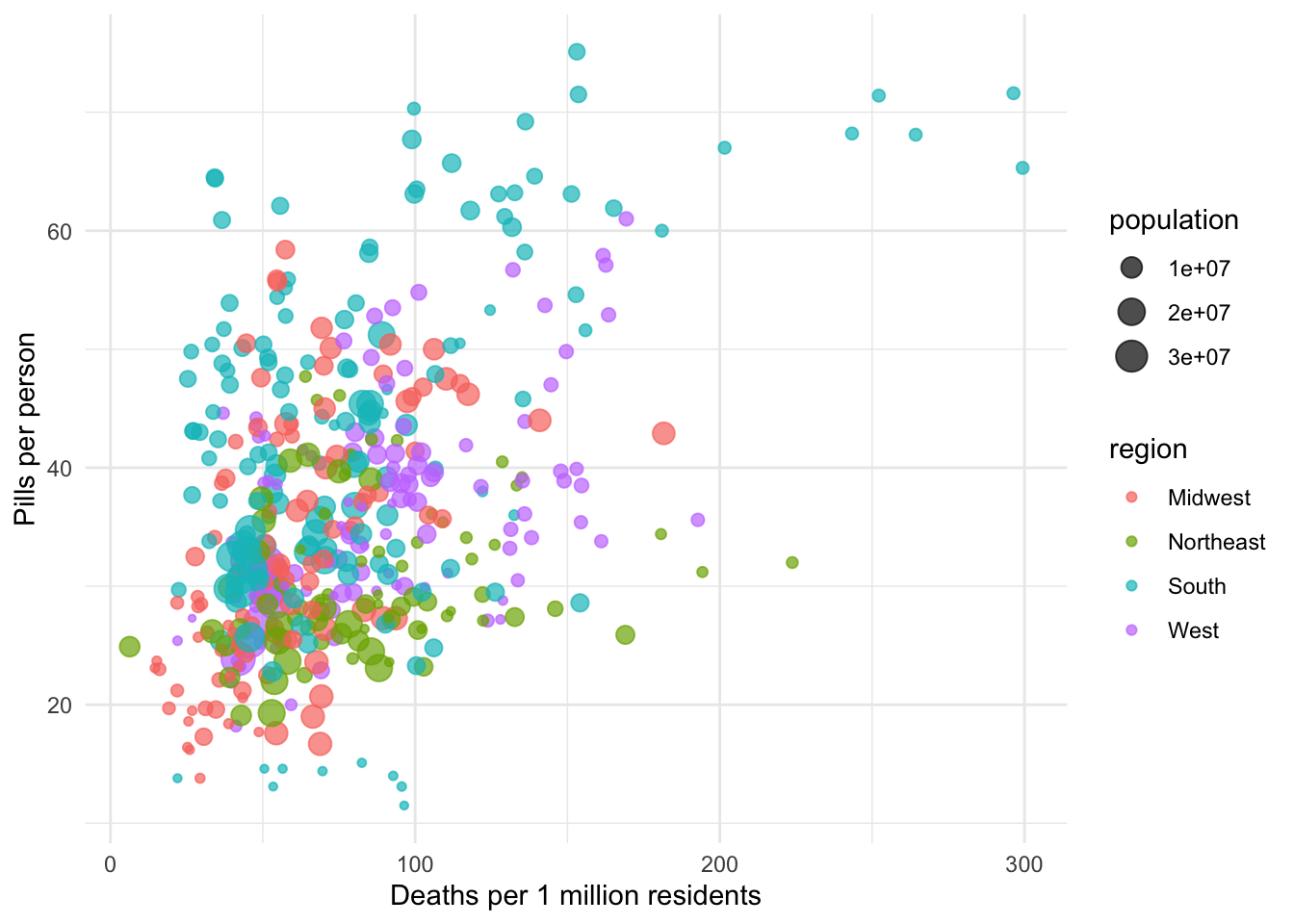
How to use gganimate
You basically need a ggplot2 viz and then think about these 3 things
transitions: Data should change
views: Does the viewpoint need to change
shadows: Should the viz have memory
Let’s add the function transition_time() and use the variable year.
We’re starting out with the ggplot2 code we saved to the object p and building onto it.
anim <- p +
  transition_time(year)

animNULLThat’s pretty damn cool!
And so simple! All that from one function!
(Okay, not so simple, we had to structure the data correctly)
But let’s add some labels so we know what the timeline is.
We’re going to add labs() with a special {frame_time} argument.
anim <- p +
  transition_time(year) +
  labs(title = 'Year: {frame_time}')

animNULLOof, it’s a little exacting with the frame time.
We can wrap up the year variable with a as.integer() function to fix it.
Also, let’s add a shadow_wake() function.
anim <- p +
  transition_time(as.integer(year)) +
  labs(title = 'Year: {frame_time}') +
  shadow_wake(wake_length = 0.1,
              alpha = FALSE)

animNULLMuch better!
Okay, let’s try one other shadow_mark() function.
anim <- p +
  transition_time(as.integer(year)) +
  labs(title = 'Year: {frame_time}') +
  shadow_mark(alpha = 0.3,
              size = 0.5)

animNULLHm, not a big fan of that one. Oh well.
Okay, one more chart!
Let’s slice out Tennesee from the data and make a line chart like we did in the geofacet.qmd file.
p <- state_df %>%
  filter(state=="Tennessee") %>%
  ggplot(aes(x=year, y=rate, color=type)) +
  geom_line() +
  theme_minimal() +
  theme(legend.position = 'bottom') +
  labs(title="Rates of opioid purchases and deaths in Tennessee",
       x = "Year",
       y = "Rate")

p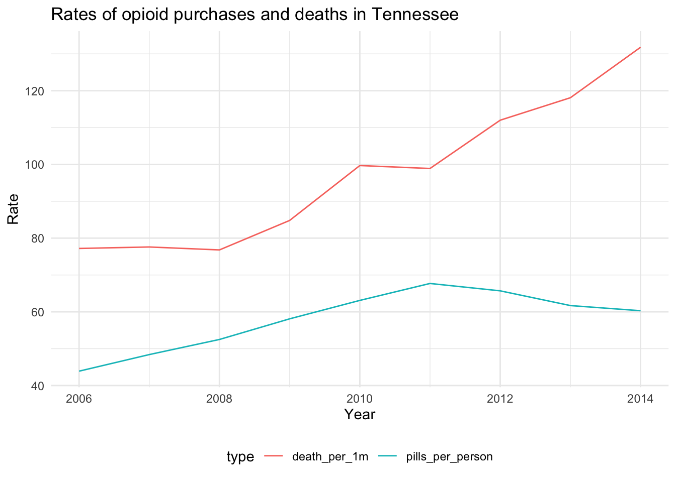
But! Let’s make it animated!
This time, we’ll use the transition_reveal() function.
p +
transition_reveal(year)NULLBeautiful!
But how about some points to highlight the years.
p +
  transition_reveal(year) +
  geom_point(aes(
    x = year, y=rate,
    color = type
))NULLVery cool. This is a really interesting way to add one more time variable to your visualization.
Great job. If you want to save it as a gif, you can do so through RStudio’s plots panel or with the function [anim_save(https://gganimate.com/reference/index.html)]
Be sure to check out gganimate.com for more documentation on animating other viz.
Let’s go back to visualizing relationships geographically, this time with a bivariate map.