# There is no need to run these install lines below if you already have done so
install.packages("usethis")
usethis::use_course("https://github.com/andrewbtran/NICAR-2020-mapping/archive/master.zip")
# This section is in scripts/05_mapbox_dotdensity.R
file.edit("scripts/05_mapbox_dotdensity.R")mapbox dot density
These days some of the best, most complicated interactive maps are being published using Mapbox.
Raster maps are so 2012.
- Armand Emamdjomeh, Graphics Reporter at The Washington Post.
It feels like a natural evolution. In fact, a lot of the same people who developed Leaflet went on to work on Mapbox.
What’s the difference?
Leaflet uses Raster Tiles while Mapbox uses Vector Tiles.
It’s like creating graphics in Adobe Photoshop versus Adobe Illustrator.
Raster versus Vector
Elements of a vector tile can be easily styled, like roads.
Vector tiles are rendered on the user end, not on the server end
It’s just faster. Vector files load 20-50 percent quicker.
Mapbox on R with Mapdeck
Just as someone made an R package that interfaces R with Leaflet, someone made a package in 2019 to interface with Mapbox: %>% %>% Mapdeck
It’s still really new. And it’ll take some time for people to create new packages that build on top of it in R. But it’s something that will definitely continue to grow in popularity.
Downside: It’s not unlimited. You’ll be charged if your map gets a lot of use.
Let’s reproduce this Washington Post map
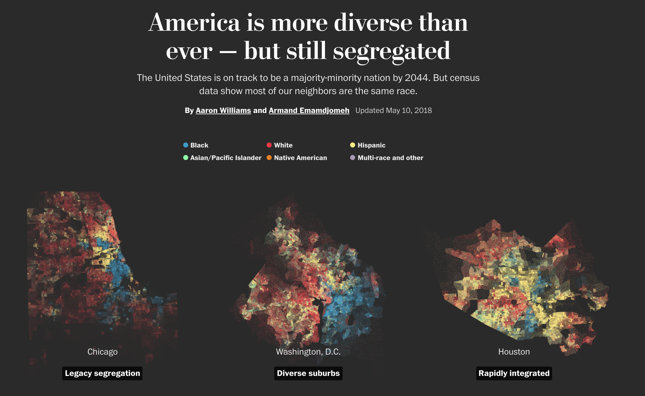
Remember this story about diversity and segregation?
Let’s see if we can get close to reproducing it.
The repo containing the data and scripts for this section is on Github. To follow along, simply run the lines of code below in R.
Get an API key
- Sign up for a Mapbox account and generate an Access token
Next, we need to load the right packages.
# This function checks if you don't have the correct packages installed yet
# If not, it will install it for you
packages <- c("sf", "tidyverse", "tigris",
"tidycensus", "mapdeck")
if (length(setdiff(packages, rownames(installed.packages()))) > 0) {
install.packages(setdiff(packages, rownames(installed.packages())), repos = "https://cran.us.r-project.org")
}
library(sf)
library(tidyverse)
library(tigris)
library(tidycensus)
library(mapdeck)The next steps involve querying the Census API with tidycensus for blockgroup-level data on population by race.
It takes a while to download and requires your own Census API key, so go ahead and just load the pre-downloaded data with the code below.
acs <- readRDS("data/acs_geoid.RDS")Here’s the R code to query and download that data on your own if you want to pull for another state (or ALL of them if you’ve got a lot of time set aside). Be sure 1) you have a solid internet connection and 2) you have a Census API key that you can substitute in.
census_key <- "YourCensusKeyGoesHere"
census_api_key(census_key)
## this function downloads the data by variables we've set
acs <- get_acs("block group", table = "B02001", cache_table = TRUE,
geometry = TRUE, state = "22",
year = 2016, output = "tidy")
## These lines cleans up the downloaded data frame
acs <- acs %>%
mutate(
id = str_extract(variable, "[0-9]{3}$") %>% as.integer
) %>%
# variable 1 is the "total", which is just the sum of the others
filter(id > 1 & id < 8) %>%
mutate(race =case_when(
id == 2 ~ "White",
id == 3 ~ "Black",
id == 4 ~ "Native",
id == 5 | id == 6 ~ "Asian",
id == 7 ~ "Other"
)) %>%
group_by(GEOID, race) %>%
summarise(estimate = sum(estimate))This is what the downloaded data from the Census looks like:
glimpse(acs)Rows: 17,355old-style crs object detected; please recreate object with a recent sf::st_crs()Columns: 4
Groups: GEOID [3,471]
$ GEOID <chr> "220019601001", "220019601001", "220019601001", "220019601001…
$ race <chr> "Asian", "Black", "Native", "Other", "White", "Asian", "Black…
$ estimate <dbl> 0, 109, 0, 0, 1121, 0, 1088, 0, 0, 412, 0, 0, 0, 0, 587, 0, 3…
$ geometry <MULTIPOLYGON [°]> MULTIPOLYGON (((-92.22295 3..., MULTIPOLYGON (((…Notice the geometry column? That’s where the polygon data resides but in a tidy format.
Let’s quickly render this on a map to see what we’ve downloaded from the Census API and what we’re working with.
First, let’s look at just one variable in the map.
# let's look at one variable so it doesn't throw off the map
acs_black <- acs %>%
filter(race=="Black")old-style crs object detected; please recreate object with a recent sf::st_crs()glimpse(acs_black)Rows: 3,471
Columns: 4
Groups: GEOID [3,471]
$ GEOID <chr> "220019601001", "220019601002", "220019601003", "220019601004…
$ race <chr> "Black", "Black", "Black", "Black", "Black", "Black", "Black"…
$ estimate <dbl> 109, 1088, 0, 378, 140, 0, 117, 0, 31, 13, 0, 39, 104, 0, 0, …
$ geometry <MULTIPOLYGON [°]> MULTIPOLYGON (((-92.22295 3..., MULTIPOLYGON (((…Let’s load the mapdeck library and put in the Mapbox API key.
library(mapdeck)
mb_key <- "PutYourKeyHere"mapdeck(token = mb_key, style = mapdeck_style("dark")) %>%
add_polygon(
data = acs_black,
fill_colour = "estimate",
fill_opacity = .4
)Registered S3 method overwritten by 'jsonify':
method from
print.json jsonliteSo how do we get from numbers tied to a polygon to dots on a map?
There’s a function in the sf package called st_sample()
Run this line of code to get the end result.
points <- readRDS("data/points_exported.RDS")
glimpse(points)Rows: 5
Columns: 2
$ race <chr> "Asian", "Black", "Native", "Other", "White"
$ geometry <MULTIPOINT [°]> MULTIPOINT ((-93.87339 32.5..., MULTIPOINT ((-94.03894 32.3..…It requires a lot of computing power to generate these samples of latitude and longitude per dot.
The code below generated the data loaded above. It could take a while to a long while for the query to run depending on the number of dots you want to plot within a polygon.
## Only run these lines of code if you have a lot of free time
## You can adjust the number of dots generated by
## dividing the estimate below (in this instance the denominator is 100)
##
generate_samples <- function(data)
suppressMessages(st_sample(data, size = round(data$estimate / 100)))
points <- map(acs_split, generate_samples)
points <- imap(points,
~st_sf(data_frame(race = rep(.y, length(.x))),
geometry = .x))
points <- do.call(rbind, points)
points <- points %>% group_by(race) %>% summarise()How’s this new data look?
points %>% mutate(n_points = map_int(geometry, nrow))Simple feature collection with 5 features and 2 fields
Geometry type: MULTIPOINT
Dimension: XY
Bounding box: xmin: -94.0418 ymin: 29.00742 xmax: -89.08941 ymax: 33.01838old-style crs object detected; please recreate object with a recent sf::st_crs()Geodetic CRS: NAD83old-style crs object detected; please recreate object with a recent sf::st_crs()# A tibble: 5 × 3
race geometry n_points
* <chr> <MULTIPOINT [°]> <int>
1 Asian ((-93.87339 32.52848), (-93.85469 32.4324), (-93.81762 32.390… 690
2 Black ((-94.03894 32.37546), (-94.0331 32.42584), (-94.02554 32.483… 14880
3 Native ((-93.94256 32.43212), (-93.82792 32.23287), (-93.82332 31.74… 175
4 Other ((-94.0048 31.98993), (-93.96876 32.48042), (-93.90314 32.437… 425
5 White ((-94.0418 32.43676), (-94.04156 32.41358), (-94.04013 32.808… 29079Okay, let’s start to visualize the data using mapdeck.
Start by adding some color styles so it matches the Post’s map.
And then we’ll use the mapdeck() function, and supply it with they API key and tile style we want.
The function for dots in mapdeck is add_scatterplot() and we can specify what data to refer to as well as what styles to use.
# setting up a color palette
m <- grDevices::colorRamp(c("aquamarine2", "dodgerblue2", "orange", "gray", "firebrick3"))(1:256/256)
# reordering the dataframe so the most populous is drawn on the map first
points <- points %>%
mutate(order=case_when(
race=="White" ~ 1,
race=="Black" ~ 2,
race=="Asian" ~ 3,
race=="Native" ~ 4,
race=="Other" ~ 5,
TRUE ~ 6
)) %>%
arrange(order)
# New map
mapdeck(token = mb_key,
style = 'mapbox://styles/mapbox/dark-v9',
zoom = 6,
location = c(-92.394604, 31.091401)) %>%
add_scatterplot(
data=points,
radius=1,
fill_opacity=.3,
fill_colour = "race",
palette = m,
layer_id = "scatter_layer",
update_view= FALSE,
#, tooltip = "race"
legend=T
)Pretty close, right?
But you zoom in and there’s some oddities, like dots in the water.
You can fix that with some R functions from the tigris package.
For now, enjoy what you’ve made.