#install.packages("usethis")
usethis::use_course("https://github.com/r-journalism/nicar-2023-fancier-viz/archive/master.zip")

# Run this in the console of RStudio
file.edit("ggrepel.qmd")ggrepel
You can follow along with the ggrepel.qmd file in the nicar-2023-fancier-viz project folder that you downloaded in the First stepslink.
If you’ve downloaded the appropriate data files and put them in a data folder, you can just copy and paste all the code in the gray boxes in an R script.
This time, we’re going to use a package called ggrepel.
Let’s load the libraries, import the state-level data and see the structure of the data we’ve imported.
library(tidyverse)
library(ggrepel)

state_df <- read_csv("data/opioids_states.csv")

glimpse(state_df)
Rows: 918
Columns: 12
$ buyer_state <chr> "AK", "AK", "AK", "AK", "AK", "AK", "AK", "AK", "AK", "AK"…
$ year <dbl> 2006, 2006, 2007, 2007, 2008, 2008, 2009, 2009, 2010, 2010…
$ pills <dbl> 15667010, 15667010, 17272433, 17272433, 18707811, 18707811…
$ state <chr> "Alaska", "Alaska", "Alaska", "Alaska", "Alaska", "Alaska"…
$ deaths <dbl> 29, 29, 15, 15, 88, 88, 90, 90, 62, 62, 66, 66, 81, 81, 69…
$ population <dbl> 675302, 675302, 680300, 680300, 687455, 687455, 698895, 69…
$ crude_rate <chr> "4.3", "4.3", "Unreliable", "Unreliable", "12.8", "12.8", …
$ type <chr> "death_per_1m", "pills_per_person", "death_per_1m", "pills…
$ rate <dbl> 42.9, 23.2, 22.0, 25.4, 128.0, 27.2, 128.8, 28.8, 87.3, 29…
$ state_code <chr> "AK", "AK", "AK", "AK", "AK", "AK", "AK", "AK", "AK", "AK"…
$ region <chr> "West", "West", "West", "West", "West", "West", "West", "W…
$ division <chr> "Pacific", "Pacific", "Pacific", "Pacific", "Pacific", "Pa…Before we proceed, let’s slice out the 2006 data only.
state_df_06 <-state_df %>%
  filter(year==2006) %>%
  pivot_wider(names_from="type", values_from="rate")

glimpse(state_df_06)
Rows: 51
Columns: 12
$ buyer_state <chr> "AK", "AL", "AR", "AZ", "CA", "CO", "CT", "DC", "DE",…
$ year <dbl> 2006, 2006, 2006, 2006, 2006, 2006, 2006, 2006, 2006,…
$ pills <dbl> 15667010, 174362638, 88505157, 177223504, 859369650, …
$ state <chr> "Alaska", "Alabama", "Arkansas", "Arizona", "Californ…
$ deaths <dbl> 29, 124, 140, 459, 1511, 326, 224, 55, 37, 1223, 331,…
$ population <dbl> 675302, 4628981, 2821761, 6029141, 36021202, 4720423,…
$ crude_rate <chr> "4.3", "2.7", "5.0", "7.6", "4.2", "6.9", "6.4", "9.6…
$ state_code <chr> "AK", "AL", "AR", "AZ", "CA", "CO", "CT", "DC", "DE",…
$ region <chr> "West", "South", "South", "West", "West", "West", "No…
$ division <chr> "Pacific", "East South Central", "West South Central"…
$ death_per_1m <dbl> 42.9, 26.8, 49.6, 76.1, 41.9, 69.1, 63.7, 96.4, 43.1,…
$ pills_per_person <dbl> 23.2, 37.7, 31.4, 29.4, 23.9, 22.9, 22.5, 11.5, 33.5,…Okay, we went from 918 rows of data to 51.
Let’s see if there’s a relationship between rates of opioid purchases and opioid deaths in 2006.
We’ll plot it out with geom_point() from the ggplot2 package.
ggplot(state_df_06, aes(x=death_per_1m, y=pills_per_person)) +
  geom_point() +
  geom_smooth(method='lm') +
  theme_minimal()
Alright, so it definitely looks like there’s something interesting here.
But it’d be nice to be able to see right away which dots represent which states.
The default method of showing text in ggplot2 is the function geom_text().
Let’s try it below.
ggplot(state_df_06, aes(x=death_per_1m, y=pills_per_person)) +
  geom_point() +
  geom_smooth(method='lm') +
  geom_text(aes(label=buyer_state), size=3) +
  theme_minimal()
Yuck, it pops up right where the dots appear. We need to move it over.
You can pass it the argument hjust and change the number till it’s just right.
Try it with .5 pixels.
ggplot(state_df_06, aes(x=death_per_1m, y=pills_per_person)) +
  geom_point() +
  geom_smooth(method='lm') +
# Changing this line
# geom_text(aes(label=buyer_state), size=3) +
  geom_text(aes(label=buyer_state), hjust=-.5, size=3) +
  theme_minimal()
Hrm, still not great. Look at the two dots under “UT” – “RNM”? What is that?
Let’s use the package ggrepel that members of the data community made that automatically moves text labels for you based on proximity of other labels.
Instead of the function geom_text(), use the function geom_text_repel().
ggplot(state_df_06, aes(x=death_per_1m, y=pills_per_person)) +
  geom_point() +
  geom_smooth(method='lm') +
# Changing this line
# geom_text(aes(label=buyer_state), hjust=-.5, size=3) +
  geom_text_repel(aes(label=buyer_state), size=3) +
  theme_minimal()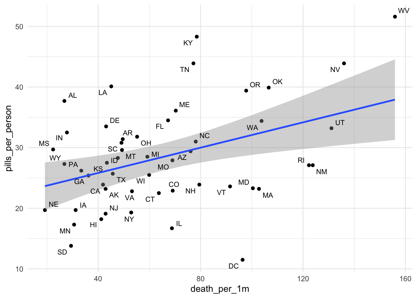
Beautiful! and so easy!
Now, you can save it as a pdf or svg and tinker with it even more in Illustrator before publishing.
Let me show you a way to show only the labels for outliers. Let’s say those with more than 120 deaths per million. It requires some nested data wrangling.
ggplot(state_df_06, aes(x=death_per_1m, y=pills_per_person)) +
  geom_point() +
  geom_smooth(method='lm') +
# Changing this line
# geom_text_repel(aes(label=buyer_state), size=3) +
  geom_text_repel(data= . %>%
                  mutate(new_label=ifelse(death_per_1m>120,
                                        buyer_state, "")),
                  aes(label=new_label), size=3) +
  theme_minimal()
A little complicated, but you just have to see it in action and you can repurpose it for what you need.
Let’s go back and put in all the years and see what the pattern is once we display the data in small multiples.
state_df_wide <-state_df %>%
  #filter(year==2006) %>%
  pivot_wider(names_from="type", values_from="rate")

ggplot(state_df_wide, aes(x=death_per_1m, y=pills_per_person)) +
  geom_point() +
  geom_text_repel(data= . %>%
                  mutate(new_label=ifelse(death_per_1m>120,
                                        buyer_state, "")),
                  aes(label=new_label), size=3) +
# new line below
  facet_wrap(~year, ncol=2) +
  theme_minimal()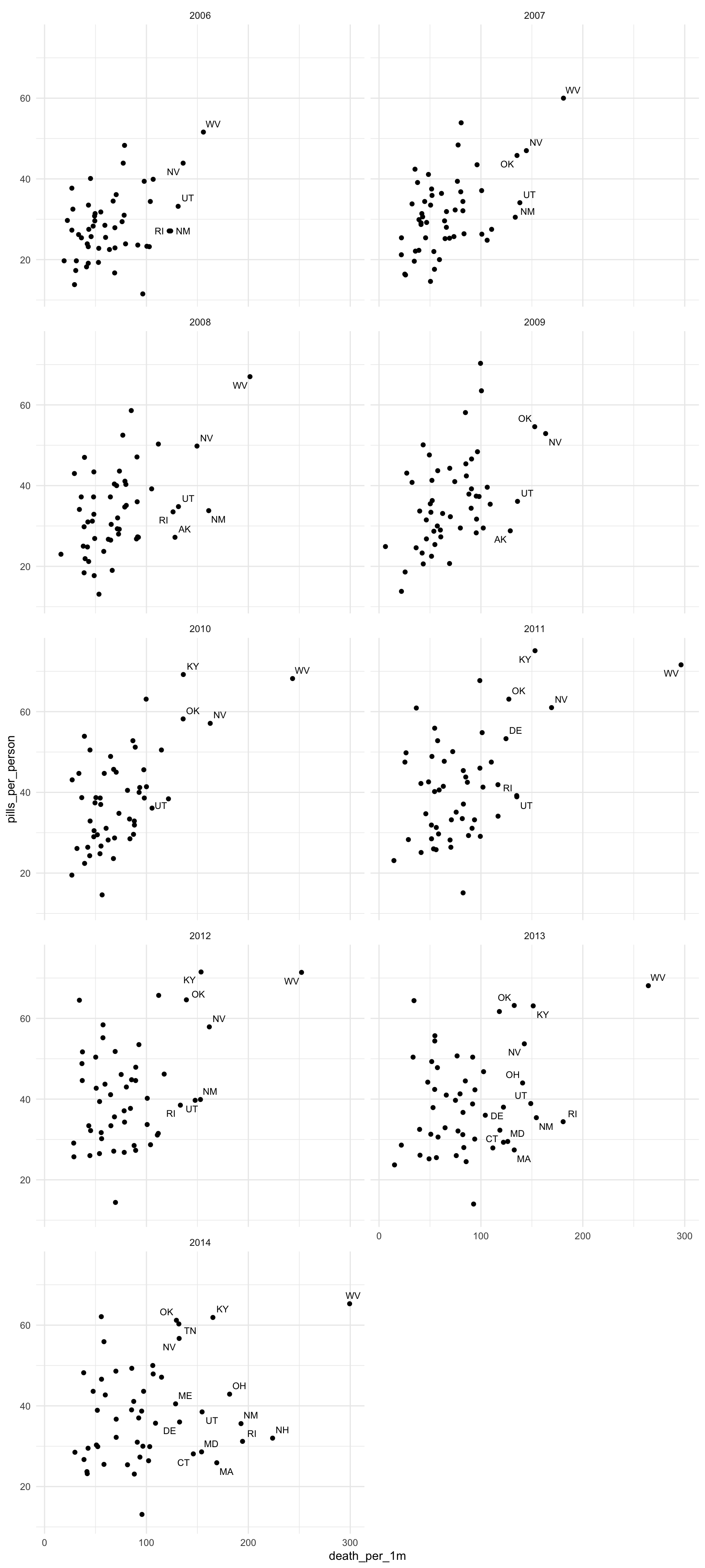
It’s very illuminating to compare 2006 to 2014.
That could make for an interesting GIF, right?
Let’s move on to gganimate.