#install.packages("usethis")
usethis::use_course("https://github.com/r-journalism/nicar-2023-fancier-viz/archive/master.zip")

# Run this in the console of RStudio
file.edit("bivariate_map.qmd")bivariate maps
You can follow along with the bivariate_map.qmd file in the nicar-2023-fancier-viz project folder that you downloaded in the First steps link.
If you’ve downloaded the appropriate data files and put them in a data folder, you can just copy and paste all the code in the gray boxes in an R script.
This time, we’re going to use a few packages: biscale, cowplot, sf, and tigris.
Let’s load the libraries, import the state-level data and see the structure of the data we’ve imported.
library(tidyverse)
library(sf)
library(cowplot)
library(biscale)
library(tigris)

county_df <- read_csv("data/opioids_counties_combined.csv")


county_df_wide <-  county_df %>%
  pivot_wider(names_from="type", values_from="rate")

glimpse(county_df_wide)
Rows: 3,135
Columns: 12
$ buyer_county <chr> "ABBEVILLE", "ACADIA", "ACCOMACK", "ADA", "ADAIR", "A…
$ buyer_state <chr> "SC", "LA", "VA", "ID", "IA", "KY", "MO", "OK", "CO",…
$ countyfips <chr> "45001", "22001", "51001", "16001", "19001", "21001",…
$ count <dbl> 10749, 55952, 19536, 290484, 5752, 21985, 32206, 2328…
$ dosage_unit <dbl> 4591000, 22197708, 6660470, 136806828, 1783165, 87831…
$ state <chr> NA, "Louisiana", "Virginia", "Idaho", NA, "Kentucky",…
$ county <chr> NA, "Acadia Parish, LA", "Accomack County, VA", "Ada …
$ deaths <dbl> NA, 39, 22, 269, NA, 14, 13, 19, 402, NA, NA, 32, NA,…
$ year <dbl> 2014, 2014, 2014, 2014, 2014, 2014, 2014, 2014, 2014,…
$ population <dbl> 25100, 62031, 33165, 409239, 7543, 19032, 25642, 2238…
$ death_per_100k <dbl> NA, 62.9, 66.3, 65.7, NA, 73.6, 50.7, 84.9, 87.1, NA,…
$ pills_per_person <dbl> 182.9, 357.8, 200.8, 334.3, 236.4, 461.5, 461.1, 384.…This is how The Washington Post visualized the geographical relationship between overdoses and purchases in their first story.
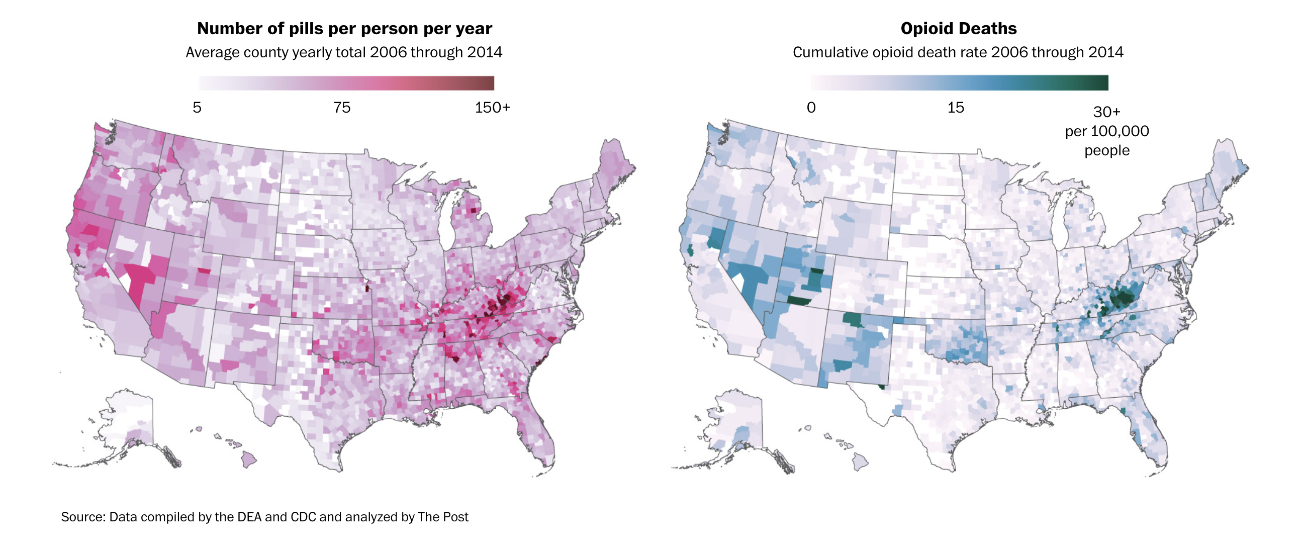
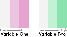
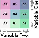
Very easy idea, right? Low values, lighter colors, high values, darker colors.
But what if we flipped one of the color schemes in the legend 90 degrees…
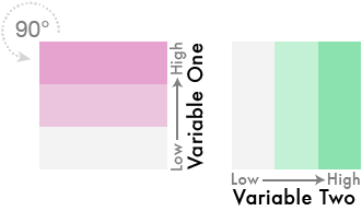
And theeeeen…
Blend them together like so…
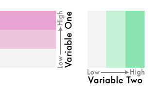
We’ve gone from three colors to nine!
This is a bivariate color scheme you’ve got going!
What’s it take normally?
It’s a little complicated– it requires dividing up your values into quantiles.

Once you have the combined labels you can assign them to a color palette that matches the bivariate theme.
Okay, that’s a lot of steps.
But someone made a package that simplifies it for us!
We’ll use the biscale package to quantile-ize and categorize the data for us.
First, let’s look at the data again.
glimpse(county_df_wide)Rows: 3,135
Columns: 12
$ buyer_county <chr> "ABBEVILLE", "ACADIA", "ACCOMACK", "ADA", "ADAIR", "A…
$ buyer_state <chr> "SC", "LA", "VA", "ID", "IA", "KY", "MO", "OK", "CO",…
$ countyfips <chr> "45001", "22001", "51001", "16001", "19001", "21001",…
$ count <dbl> 10749, 55952, 19536, 290484, 5752, 21985, 32206, 2328…
$ dosage_unit <dbl> 4591000, 22197708, 6660470, 136806828, 1783165, 87831…
$ state <chr> NA, "Louisiana", "Virginia", "Idaho", NA, "Kentucky",…
$ county <chr> NA, "Acadia Parish, LA", "Accomack County, VA", "Ada …
$ deaths <dbl> NA, 39, 22, 269, NA, 14, 13, 19, 402, NA, NA, 32, NA,…
$ year <dbl> 2014, 2014, 2014, 2014, 2014, 2014, 2014, 2014, 2014,…
$ population <dbl> 25100, 62031, 33165, 409239, 7543, 19032, 25642, 2238…
$ death_per_100k <dbl> NA, 62.9, 66.3, 65.7, NA, 73.6, 50.7, 84.9, 87.1, NA,…
$ pills_per_person <dbl> 182.9, 357.8, 200.8, 334.3, 236.4, 461.5, 461.1, 384.…Next, we need to use the function bi_class() and feed it the arguments for the two columns we want to turn into quantiles. Also, we can set the dimensions to 3x3 (you could do 4x4, etc).
bi_df <- bi_class(county_df_wide, x = death_per_100k, y = pills_per_person, style = "quantile", dim = 3)

glimpse(bi_df)
Rows: 3,135
Columns: 13
$ buyer_county <chr> "ABBEVILLE", "ACADIA", "ACCOMACK", "ADA", "ADAIR", "A…
$ buyer_state <chr> "SC", "LA", "VA", "ID", "IA", "KY", "MO", "OK", "CO",…
$ countyfips <chr> "45001", "22001", "51001", "16001", "19001", "21001",…
$ count <dbl> 10749, 55952, 19536, 290484, 5752, 21985, 32206, 2328…
$ dosage_unit <dbl> 4591000, 22197708, 6660470, 136806828, 1783165, 87831…
$ state <chr> NA, "Louisiana", "Virginia", "Idaho", NA, "Kentucky",…
$ county <chr> NA, "Acadia Parish, LA", "Accomack County, VA", "Ada …
$ deaths <dbl> NA, 39, 22, 269, NA, 14, 13, 19, 402, NA, NA, 32, NA,…
$ year <dbl> 2014, 2014, 2014, 2014, 2014, 2014, 2014, 2014, 2014,…
$ population <dbl> 25100, 62031, 33165, 409239, 7543, 19032, 25642, 2238…
$ death_per_100k <dbl> NA, 62.9, 66.3, 65.7, NA, 73.6, 50.7, 84.9, 87.1, NA,…
$ pills_per_person <dbl> 182.9, 357.8, 200.8, 334.3, 236.4, 461.5, 461.1, 384.…
$ bi_class <chr> "NA-1", "2-2", "2-1", "2-2", "NA-1", "2-3", "1-3", "2…Great, do you see the bi_class column? That’s what we’re looking for.
Now we can map it.
You can export the data frame above and bring it into Datawrapper and individually create an interactive choropleth map based on the bi_class column. It’s totally doable! Check out their recent blog post on playing around with bivariate maps.
They haven’t made the option seamless yet. It’ll require a lot of tweaking.
In the meantime, just go ahead and make a map with ggplot2.
First, let’s download the counties shapefile from the Census using the tigris package.
us_counties <- counties(cb = TRUE, resolution = "20m") %>%
     shift_geometry()

glimpse(us_counties)
Just to check, let’s see what it looks like without data.
ggplot(us_counties) +
  geom_sf() +
  theme_void()
Okay, now we can join the shapefile with the bivariate data.
us_counties <- us_counties %>%
  left_join(bi_df, by=c("GEOID"="countyfips"))
Now, we simply map it.
For the color, we need to use the function bi_scale_fill() to accurately represent the bivariate categories with colors. Check out all the palette options. We’re going go with “DkViolet”
map <- ggplot() +
  geom_sf(data = us_counties, mapping = aes(fill = bi_class),
          # changing the border color to white and the size of the
          # border lines to .1
          # and hiding the legend
          color = "white", size = 0.1,
           show.legend = FALSE) +
  bi_scale_fill(pal = "DkViolet", dim = 3, na.value="white",) +
  labs(
    title = "Deaths & Pills"
  ) +
  bi_theme()
map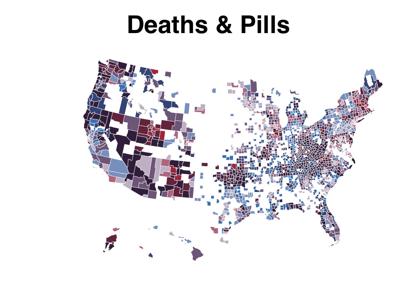
Alright, we’re not done, yet.
Let’s create a legend with custom labels.
legend <- bi_legend(pal = "DkViolet",
                    dim = 3,
                    xlab = "+ death rate ",
                    ylab = "+ pills rate ",
                    size = 8)

legend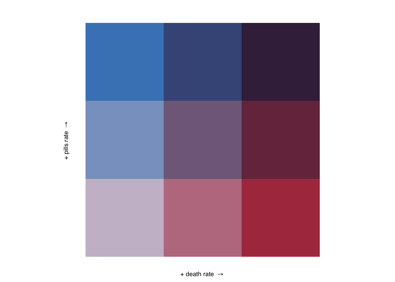
Pretty huge, yes.
But we’re going to use the package cowplot to combine these two viz objects in one. It’ll initiate with the function ggdraw().
The numbers in draw_plot() represent the relative spots to anchor the viz.
finalPlot <- ggdraw() +
  draw_plot(map, 0, 0, 1, 1) +
  draw_plot(legend, 0.82, .2, 0.2, 0.2)

finalPlot
Now you can save it as a png or a svg file to edit.
save_plot("test.svg", finalPlot, base_height = NULL, base_width = 12)Let’s do it one more time but zoomed in on Tennesee.
We can do the same thing above but we’ll simply filter it real quick before using the same code.
tn_counties <- us_counties %>%
  filter(buyer_state=="TN")

map <- ggplot() +
  geom_sf(data = tn_counties, mapping = aes(fill = bi_class),
          # changing the border color to white and the size of the
          # border lines to .1
          # and hiding the legend
          color = "white", size = 0.1, show.legend = FALSE) +
  bi_scale_fill(pal = "GrPink", dim = 3) +
  labs(
    title = "Deaths & Pills in Tenn."
  ) +
  bi_theme()


finalPlot <- ggdraw() +
  draw_plot(map, 0, 0, 1, 1) +
  draw_plot(legend, 0.82, .2, 0.2, 0.2)

finalPlot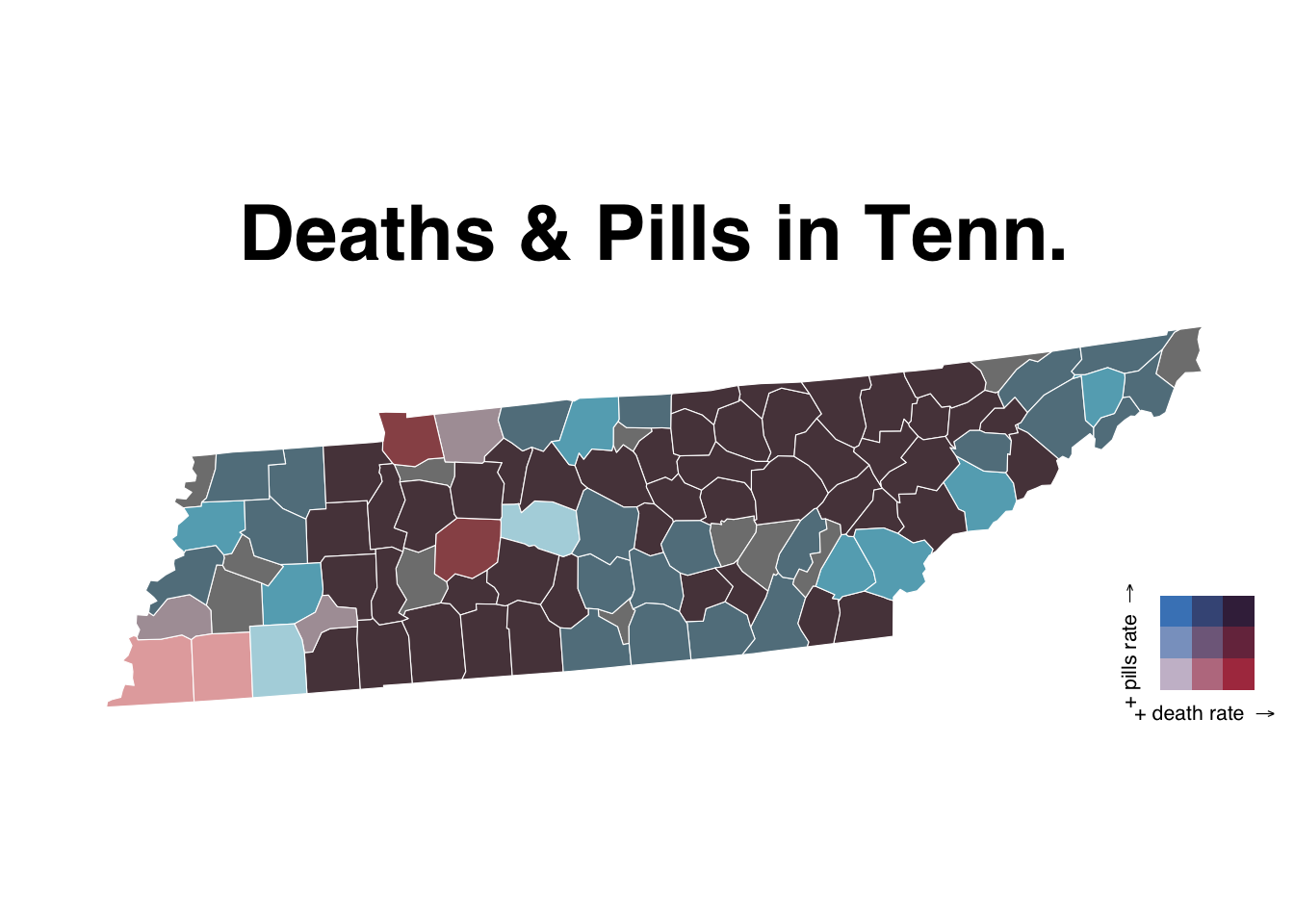
And that’s it.
Definitely check out the rest of the documentation of biscale.
Do we even have time to make a fifth viz? Let’s give it a shot.
Move on to ggtext.